ShodhKosh: Journal of Visual and Performing ArtsISSN (Online): 2582-7472
|
|
Visual Communication through AI-Generated Infographics
Dr. Aparna Marwah 1![]() , Dr. Ashok Rajaram Suryawanshi 2
, Dr. Ashok Rajaram Suryawanshi 2![]() , Dr. Ganesh Ramkrishna Rahate 3
, Dr. Ganesh Ramkrishna Rahate 3![]() , Dr. Anuj Kumar Singh 4
, Dr. Anuj Kumar Singh 4![]() ,
,
Dr. Suvarna Patil 5![]()
![]() ,
Dharmesh Dhabliya 6
,
Dharmesh Dhabliya 6![]()
1 Associate
Professor, Department of Management Studies Bharati Vidyapeeth (Deemed to be
University) Institute of Management and Research (BVIMR), New Delhi, India
2 Pimpri
Chinchwad College of Engineering, Department of Electronics and
Telecommunication Engineering, India
3 Department of Electronics and Telecommunication Engineering, Pune,
India
4 Associate Professor, School of Computing Science and Engineering
Galgotias University, Greater Noida, India
5 School of Engineering, Management and Research, D Y Patil
International University, Akurdi Pune, India
6 Vishwakarma Institute of Technology, Pune, Maharashtra, India
|
|
|
ABSTRACT |
|
|
Visual
communication is already an essential tool used to deliver sophisticated
information in data-driven societies in the most effective way. As a
combination of visual design, narrative, and presentation of data,
infographics is at the heart of creating the understanding, interest, and
judgment. As a result of recent developments in the sphere of artificial
intelligence (AI), the work of infographics creation is becoming more
automated, which alters the traditional design processes. This paper examines
the theme of visual communication in terms of AI-generated infographics, how
computational models redefine the time-tested principles of perception,
semiotics, and information design. The paper incorporates cognitive theory of
the visual perception along with semiotic encoding theory to put into
perspective how AI systems transform the data into meaningful visual
representation. It also examines how machine learning and deep learning
algorithms, e.g., pattern recognition, layout optimization, style transfer,
etc., can be used to automate the process of infographic creation. The
outcomes are the visual quality, clarity, the aesthetic coherence, and the
storyline effectiveness, with the results of AI-generated visuals and
human-designed infographics being compared. The results show that the AI
systems show high consistency, scalability, and accuracy in data, and have
low-contextual creativity, cultural sensitivity, and interpretability. Other
issues identified in the study include data bias problems, automation-creativity
trade-offs and design decision explainability. |
|||
|
Received 07 September 2025 Accepted 02 December 2025 Published 17 February 2026 Corresponding Author Dr.
Aparna Marwah, aparna.marwah@bharatividyapeeth.edu DOI 10.29121/shodhkosh.v7.i1s.2026.7032 Funding: This research
received no specific grant from any funding agency in the public, commercial,
or not-for-profit sectors. Copyright: © 2026 The
Author(s). This work is licensed under a Creative Commons
Attribution 4.0 International License. With the
license CC-BY, authors retain the copyright, allowing anyone to download,
reuse, re-print, modify, distribute, and/or copy their contribution. The work
must be properly attributed to its author.
|
|||
|
Keywords: Artificial Intelligence, Visual Communication,
Infographic Generation, Data Storytelling, Information Design |
|||


1. INTRODUCTION
The visual mode of communication has been an essential process under which humans perceive, organize, and pass information. Since the dawn of symbolic representations, visual artifacts decrease the cognitive load and promote meaning-making through the use of perceptual and cognitive efficiencies. With the current digital space where there is information overload, the skill of simplification and speed in communication of complex information has become very important. Infographics have become a significant visual communication tool, and a combination of data, design, and storytelling to aid the understanding, interaction, and decision-making in the fields of education, journalism, public policy, healthcare, and business intelligence. Historically, the design of infographics is a human-oriented, creative design that needs skills in visual perception, graphic design, semiotics, and data narrative. The designers have to strike a balance between accuracy, aesthetics, hierarchy, and narrative coherence and transform visual forms to meet the needs of the audience and situational constraints Epstein et al. (2023). Nonetheless, the increasing amount, pace and complexity of information within digital ecosystems threaten the ability of manual infographics development to scale and be effective. This has driven the incorporation of artificial intelligence (AI) into the visual communication processes, with the possibility to generate infographics automatically or semi-automatically based on structured and unstructured sources of data. Recent research on AI and its application in machine learning and deep learning has greatly increased the potential to create visual information in computational systems. Pattern recognition and layout optimization, natural language processing and generative modeling are some of the techniques that enable AI systems to determine salient data characteristics, use suitable visual encodings, and construct coherent graphic structures Tian and Günther (2024).
Consequently, AI-created infographics are becoming more popular with data journalism websites, dashboard applications, educational technologies, and real-time analytics applications. These systems are vowed of efficiency, consistency, and scalability and reduce technical impediments of visual communication to non-designers. Although these improvements have been made, the use of AI in the creation of infographics brings up significant theoretical and practical issues Shi et al. (2023). Visual communication is not just a technical interpretation of data into the graphics, it is rooted in the cognitive processing, cultural norms, and meaning of the semiotic interpretation. The visuals created by human designers are based on the contextual knowledge, emotional context, and creativity to be considered in creating images that engage audiences Liu et al. (2024). Conversely, AI systems are based on the observed trends and optimization goals which do not entirely operate outside of subjective meaning, cultural sensitivity, or narrative intent. The figure below Figure 1 presents data extraction, transformation, and loading which allow reporting This tension is where it is necessary to take a close look at how AI-generated infographics can be using the established principles of visual perception, information design, and data storytelling.
Figure 1
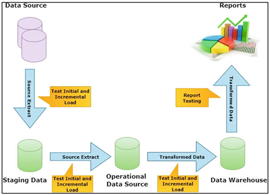
Figure 1 ETL (Extract–Transform–Load) Workflow for Data
Warehousing and Reporting
In addition to this, the increased use of AI-driven design brings about issues of data bias, representational fairness, and transparency. In case the training material is biased or constrained by design patterns, then the infographics produced by AI can unintentionally perpetrate misrepresentation or oversimplification Tang et al. (2024).
2. Theoretical Foundations of Visual Communication
2.1. Cognitive Theories of Visual Perception
The cognitive theories of visual perception are the explanations of how the human being receives, interprets, and retains visual information to create the psychological underpinning of effective visual communication. Human vision is not an active recording process but an active interpretive process that is influenced by attention, memory and background knowledge. Gestalt psychology is still to the forefront of the theory of visual perception, which holds to the proximity, similarity, continuity, closure, figureground separation Tang et al. (2024). These principles explain the way the viewers tend to arrange the visual elements in order to form coherent wholes, thus allowing them to quickly perceive the complex scene. Infographic design (both human- and AI-designed) is dependent on these perceptual tendencies in order to organize information intuitively. The other important component is cognitive load theory which focuses on the working memory limits. Visual representations help to minimize the mental work by externalization of information and use of parallel processing possibilities of the visual system. Infographics with adequate design can present information in a spatial manner, which reduces the use of unneeded mental processing and enables users to attend to meaning instead of trying to communicate the structure Lin et al. (2024). Color, contrast, and hierarchy also direct the visual attention and allow the viewers to recognize the salient objects in a short period of time Omeje and Ferdinanad (2025).
2.2. Semiotics and Visual Encoding Principles
The history of sign and meaning-making, semiotics offers a conceptual perspective on the way images convey the information that is not limited to aesthetics. Signifiers (visual forms) and signified concepts (meanings) are the signs in visual communication. Infographics are based on the first-order semiotic systems which are icons, symbols, colors, and space organization to represent abstract data in forms that can be interpreted. Such signs can be either icons (similar to the thing to which they refer to), indexes (to show relationships), or symbols (arbitrary yet learned in culture) and each of them has to be interpreted with varying degrees by viewers Cheng et al. (2024). The encoding principles are used to convert the data properties into the visual variables that include position, size, shape, color, orientation, and texture. The semiotic theory states that good encoding has an unambiguous and consistent mapping between the values of data and visual representations. As an illustration, color gradient can be used as an indicator of magnitude whereas shapes can distinguish categories Xiao et al. (2025). Conventions are important; colors, symbols, and metaphors might have a different meaning in different situations, which can result in misinterpretations and distrust. Semiotic is of particular significance in the case of AI-generated infographics since algorithms have to be taught not just visual conventions, but also culturally and contextually adequate sign systems. Even a purely statistical mapping can create technically correct images, which are semantically incorrect.
2.3. Information Design and Data Storytelling
Information design is the art of organizing and presenting information so that it is more understandable, user-friendly and comprehensible. It also focuses on the concepts of hierarchy, alignment, consistency, balance and simplicity to make sure that visual artifacts convey effectively. Information design in infographics regulates the arrangement of data within a space, the degree of emphasis placed on data and the navigation of visual information by the user. Good information design lowers the level of ambiguity, facilitates comparison, and allows the viewer to extract information with the minimal effort Zhou et al. (2024). Information design Data storytelling goes beyond information design and integrates narrative structure in visualization. Data storytelling puts information into a logical context, which emphasizes circumstances, causality and implications, instead of displaying independent pieces of information. The narrative infographics tend to have a logical flow, introducing a problem, showing evidence, and coming to an interpretation or an action. Overviews the previous research tendencies, techniques, usage, and results in AI-based visual communication Dou et al. (2024). Such framing of the narrative increases the level of engagement and it is easier to interpret, especially among non-expert audiences. In the case of AI-generated infographics, data storytelling to computational logic is a big challenge to translate.
Table 1
|
Table 1 Summary of Related Studies on AI, Infographics, and Visual Communication |
||||
|
Application Domain |
AI Technique Used |
Infographic Type |
Key Findings |
Limitations |
|
Data Journalism |
Rule-based design |
Statistical |
Emphasized narrative clarity
in infographics |
Limited automation |
|
Cognitive Visualization |
Perceptual modeling |
Conceptual |
Linked visual form to
cognition |
No AI generation |
|
Automated Visualization Huang et al. (2024) |
ML classification |
Statistical |
Automated chart selection
effective |
Weak narrative flow |
|
Graphic Design |
CNN-based layout |
Static |
Improved layout consistency |
Dataset bias |
|
Visualization Systems Ding et al. (2023) |
Hybrid rules + ML |
Interactive |
Enhanced user exploration |
High system complexity |
|
Infographic Design |
GANs |
Narrative |
Rich visual styles generated |
Low explainability |
|
Design Automation |
Reinforcement learning |
Statistical |
Optimized readability |
Creativity constraints |
|
Visual Storytelling Weng et al. (2024) |
NLP + ML |
Narrative |
Improved data–text alignment |
Context sensitivity |
|
Educational Media |
Transformer models |
Conceptual |
Better conceptual clarity |
High training cost |
|
Dashboard Analytics |
Deep learning |
Interactive |
Scalable infographic
generation |
Limited personalization |
|
Business Intelligence |
AutoML pipelines |
Statistical |
Fast, consistent outputs |
Conservative designs |
|
Public Communication |
Explainable AI |
Static |
Improved transparency |
Reduced flexibility |
|
Visual Communication |
Hybrid AI framework |
Multi-type |
Balanced AI–human strengths |
Requires human oversight |
3. Infographics: Design Principles and Typologies
3.1. Static vs. Interactive Infographics
One of the most common typologies in visual communication is static and interactive infographics, which are used in the visual communication with different purposes. Infographics which are not dynamic Static infographics comprise a fixed visual object to be printed or displayed digitally, that is, non-responsive and shows information in a single format. Their advantageous side is in simplicity, availability, and simplicity in distributing it in such platforms as reports, academic journals, and social media. The use of visual hierarchy, brief labelling, and explicit encoding to give messages in a concise manner makes the use of static designs especially efficient in giving summaries of insights or the description of high-level narratives. Interactive infographics, in their turn, allow user interaction with the interactions that can be hovering, filtering, zooming, or clicking. These designs are suitable in exploratory data analysis as the user can browse through complex data at their own rhythm. Personalization and depth are increased by interactivity where the viewers are able to explore hidden depth of information. Nevertheless, interactive infographics require more cerebral effort and technology, such as the consideration of the responsive design and user interface. As an AI-generation, static infographics are relatively less complicated to automate, since it includes optimizing one layout and visual mapping. Interactive infographics bring about an extra level of complexity where the AI systems need to simulate user behavior, interaction patterns and adaptive content delivery.
3.2. Narrative, Statistical, and Conceptual Infographics
Communicative purpose other typologies of infographics include narrative, statistical, and conceptual. Narrative infographics are more focused on narration and they follow a systematic series of visual content that leads viewers to a message or argument. They can frequently combine schedules, sequence of actions, or marked images to formulate significance and connection. Narrative designs are particularly useful in journalism, education, and advocacy, where the importance of data is not as great as the comprehension of the situation. Infographics Statistical infographics are associated with the quantitative representation of data. They mainly aim at precision, comparison and pattern recognition. This typology is characterized by charts, graphs, maps, and numeric indicators that help viewers to determine trends, correlations, and distributions. To prevent the distortion and misinterpretation, statistical infographics require strict visual encoding decisions. Both clarity and scale precision and minimal embellishment are important in upholding credibility. Conceptual infographics refer to the expressions of abstract concepts, processes, or structures without utilizing numerical data.
3.3. Color Theory, Typography, and Layout Strategies
The basis of design concepts that influence the success of infographics are the color theory, typography, and layout strategies. Color is very important in visual hierarchy, emotional appeal and categorical differentiation. Attention, data values encoding and enhanced readability are guided by strategic use of hue, saturation and contrast. Nevertheless, inappropriate color usage may lead to the introduction of perception bias, decrease accessibility, or bring about misinterpretation, so it is critical to comply with the principles of color harmony and accessibility. Typography has an effect on the tone and legibility. The choice of typeface, the font, the spacing and alignment of the textual elements determine the ease with which textual elements can be scanned and read. Regular typographic hierarchy assists to distinguish between headings, labels and annotations, which enables the navigation use of visual information easily. Typography in infographics should have aestheticism and functionalism, particularly in cases where copious information is being incorporated. Layout strategies are techniques that arrange visual materials in a space so as to give structure and movement. The concepts of coherence and the minimization of cognitive overload are achieved with the help of alignment, proximity, balance, and whitespace. Competent layouts take the viewer through rational directions, and support the narrative or analytic purpose. It is hard to encode these design principles in computational models in AI-generated infographics. Algorithms can be taught color palettes and layout patterns but not aesthetic judgment and sensitivity to context are complicated.
4. Artificial Intelligence in Infographic Generation
4.1. Overview of AI Techniques for Visual Content Creation
The field of artificial intelligence has brought on-board revolutionary methods of visual content generation that can autonomously produce graphics, layouts and data-driven graphics. AI systems in the generation of infographics combine data processing, visual encoding, and design synthesis in a single pipeline. One of the oldest methods was rule-based systems that were based on predefined templates and heuristics to align the data attributes to visual elements. Effective and reliable, these systems were not versatile and imaginative. Figure 2 indicates how the rule-based systems evolved into sophisticated generative AI models. The modern methods of AI use machine learning, natural language processing, and generative models more frequently in order to become more flexible.
Figure 2

Figure 2 Evolution of AI Techniques for Automated Visual
Content and Infographic Generation
NLP helps the AI to identify semantic meaning in textual content, title, or annotations and guide the design process and the narrative form. Image recognition, icon selection and visual consistency between design elements is aided by computer vision techniques. Generative methods, such as procedural graphics and probabilistic modeling enable systems to search through a variety of design variations, or reinforcement learning is being explored as a promising algorithm whereby agents may explore design quality optimization as a form of optimization. Those methods allow the adaptive refinement of the visual outputs by using the feedback loop.
4.2. Machine Learning and Pattern Recognition in Design
In infographic generation, machine learning is a key ingredient in facilitating the recognition of design decisions by AI systems which are guided by patterns. Large datasets of professionally crafted infographics are typically trained to supervised learning models, which learns the associations between different types of data and associations between data and visual encodings, as well as different layout structures. These models recognize the similarity in the use of color, typography, spacing and iconography based on feature extraction, and can be used to recreate existing design conventions automatically. Clustering and dimensionality reduction are examples of unsupervised learning methods that can be used to reveal latent design structures that are not explicit. Such approaches may cluster similar visual styles, find common layout archetypes or detect visual redundancies. These insights can aid the adaptive design generation process in which the AI systems will choose suitable visual patterns according to the data characteristics or preferences of the user. User behavior analysis is also a branch of pattern recognition. Machine learning models can be trained to determine which visual designs are more interesting or understandable by taking into account interaction data including clicks, dwell time or navigation paths. This learning that is based on feedback enables a gradual enhancement of the quality of the infographics. Although these benefits exist, the design systems based on machine learning have generalization and bias-related issues. The models trained on small or homogenous datasets can be overfitted on certain styles and lack diversity and cultural flexibility.
4.3. Deep Learning Models for Layout and Style Generation
Deep learning techniques have greatly contributed to the automation of style and layout creation in infographics. Convolutional neural networks are popular in visualizing spatial relationships among visual features, where hierarchical features are learned to give information on alignment, grouping, and balance. These models allow AI systems to produce layouts that follow principles of perceptions like visual hierarchy and symmetry. Of special importance in style generation are generative models such as variationalautoencoders and generative adversarial networks. These models are able to encode latent representations of design aesthetics which allow them to synthesize a wide variety of visual styles and still be consistent. Style transfer can also be used to ensure that AI systems can use aesthetic patterns they have learned (color palettes or typographic themes) when applied to the various infographic content and improve visual connection by doing so. Transformer-based architectures go additional on deep learning abilities, by modeling worldwide connections between design parts. These models are based on attention mechanisms that help them to capture the long-range dependencies to make sure that layout decisions are kept consistent in complex compositions.
5. Methodology
5.1. Dataset Description and Design Inputs
The design approach based on AI-generated infographics starts with the creation of a structured and varied dataset which includes the data contents and the visual design characteristics. The data is normally in a tabular numerical format, categorical data, textual descriptions and metadata of the context of the domain. Authoritative sources can be public datasets, artificial data, and repositories of curated design on infographics that are created by professionals. The data instances are augmented with specific design annotations including but not limited to: chart type, color palette, typography style, layout structure, and narrative intent, and allow the supervised learning and the extraction of design patterns. The formulation of design inputs is done on different levels of abstraction. On the semantic level, inputs present the communication goal, target audience and contextual constraints. Input variables can be defined at the data level, in terms of type, range and the relationship of variables. At the visual level, there are such constraints as the color preferences, accessibility, and stylistic rule. These multi-layered input enable the AI system to adjust the visual output in regards to the data traits as well as the design purpose. Preprocessing is a significant element, which entails the normalization of data, missing value, and semantic labeling. The visual design characteristics are represented numerically to make them easy to learn.
5.2. AI Models and Algorithms Employed
The proposed methodology will utilize a combination of AI models and algorithms in the multifaceted character of the infographic generation. Rule-based elements are combined to impose the basic assumptions of design like alignment, spacing, and accessibility requirements. These fixed rules provide a minimum visual consistency and eliminate the breaking of the rules in design. Machine learning models are then learnt on this basis to learn data-to-visual mappings. The informed learning algorithms categorize the suitable type of infographics by the structure of the data and the purpose of communication. The unsupervised learning methods aid in style clustering as well as layout pattern discovery to enable adaptive design selection. In order to optimize layout refinement, reinforcement learning is utilized in which reward functions are used that account for measurements of readability, aesthetic balance, and user engagement. Deep learning models are also capable of greater generativeness. Convolutional neural networks can learn spatial relationships between visual features whereas transformer-based systems learn global dependencies between layouts. Variationalautoencoders, or other forms of generative models, allow synthesis and variation of style using the same input data and allow generation of several design options. Model selection puts more emphasis on interpretability, scaling and performance. Cross-validation and regularization are used as training procedures to avoid overfit.
5.3. Experimental Setup and Toolchain
The experimental design is aimed at the systematic evaluation of the effectiveness of AI-generated infographics in controlled conditions through the experimental setup. The inputs that contain the data are separated into training, validation and testing subsets so as to provide robust performance evaluation. The situation of the baseline is set against infographic generators based on templates, and the infographics produced by skilled designers. This comparative framework allows objective assessment of the AI performance as compared to the established practices. The tool chain incorporates elements of data processing, model training and visualization rendering. The statistical and scripting data cleaning and transformation tools are used to perform the data preprocessing. The models based on machine learning and deep learning are deployed in the generally adopted AI frameworks which facilitate the experimental modules and repeatability. Final infographics are created in scalable forms by use of visualization libraries and vector graphic engines. Assessment plans have both quantitative and qualitative data. Layout consistency, information density and structural accuracy are evaluated using quantitative measures, whereas qualitative measures evaluate the layout using expert reviews and with user studies based on clarity, aesthetics and interpretability. Where applicable, data on user interaction is recorded to facilitate optimization which is driven by feedback.
6. Results and Analysis
6.1. Quality Assessment of AI-Generated Infographics
The evaluation of AI generated infographics is based on visual clarity, structural coherency, aesthetical balance and data faithfulness. Findings have shown that AI systems are always capable of generating layouts that have a clear hierarchy, data encoding, and consistent with the design principles. There is also a high consistency in the use of color as well as typography, especially where statistical and template-driven designs are to be used. Automated results are also highly scalable with high repeatability, producing various versions of a design at an efficient scale using the same data. Nevertheless, constraints arise in the nuance of the storytelling and the focus on the context, as sometimes AI-based infographics concentrate too much on the consistency at the cost of a story. Critic reviews point to the fact that visual accuracy is high, but less subtle design considerations (such as emotional coloring, cultural symbolism, rhetorical accentuation) are not reflected.
Table 2
|
Table 2 Quantitative Quality Evaluation of AI-Generated Infographics |
|
|
Evaluation Metric |
Score / Value |
|
Visual clarity score |
4.2 |
|
Layout coherence index |
88.5 |
|
Data accuracy |
97.8 |
|
Color harmony consistency |
4.1 |
|
Typography readability |
4 |
|
Information density
efficiency |
85.2 |
|
Narrative structure adequacy |
3.6 |
The full assessment of the quality in Table 2 shows that the AI-created infographics have a high degree of balance between visual and informative performance. The result of a visual clarity score of 4.2 and layout coherence index of 88.5 indicate that structural organization and visual hierarchy are effectively optimized so that the user can understand important messages within a short time frame. Figure 3 illustrates the comparative performance of visual quality measures of infographics generated by AI. The excellent data accuracy (97.8) demonstrates how the AI pipeline can be trusted to maintain the numerical accuracy of visual transformation which is crucial in the analytical and decision-support setting.
Figure 3
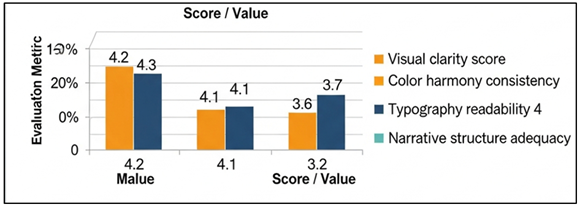
Figure 3 Comparative Evaluation Scores of Visual Design
Quality Metrics for AI-Generated Infographics
The consistency of color harmony (4.1) and typography readability (4.0) points to the idea that most of the design principles are already observed, but it is still possible to optimize the font size and contrast in various situations of viewing. Figure 4 illustrates patterns of distribution of important quality metrics in AI infographics. The efficiency of the information density of 85.2 is associated with the successful compression of complex information and does not overload the users.
Figure 4
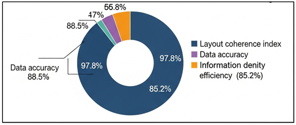
Figure 4 Distribution of Core Quality Metrics in AI-Generated
Infographic Evaluation
The relatively low narrative structure adequacy score (3.6) however, shows that though the individual visual elements are strong, the sequential narrative and context flow can be used to enhance the story. This can be improved by adding semantic connection between partitions and adding guided visual information that can further improve interpretability and engagement.
6.2. Comparative Analysis with Human-Designed Infographics
The comparative study shows weaknesses and strengths of the AI-generated and human-designed infographics. In narratively coherent, creative, and contextually tailored design, human designers excel over AI systems especially in conceptual and narrative-driven designs. This makes them more interesting and convincing to the audience because their capacity to combine background information with the sensitivity of the audience makes the visuals more compelling. On the other hand, AI-generated infographics have better consistency, speed and scalability particularly to data-intensive and repetitive visualization tasks. Quantitative assessments indicate that there is little difference between accuracy of data and readability, and qualitative assessment includes human designs as more original and emotional resonant. It has been recommended by users to use AI-generated infographs in an analytical and operational context and human-created infographs in an exploratory, educational, and persuasive one. These conclusions support the opinion that AI will be applied as a complementary design tool, not a replacement of human creativity.
Table 3
|
Table 3 AI-Generated vs. Human-Designed Infographics: Comparative Results |
||
|
Evaluation Parameter |
AI-Generated |
Human-Designed |
|
Visual clarity score (%) |
82 |
85 |
|
Data accuracy (%) |
97.8 |
98.4 |
|
Narrative coherence (%) |
66 |
86 |
|
Creative originality (%) |
64 |
87 |
|
Layout consistency (%) |
88.5 |
85.1 |
|
Design time per infographic |
2.8 sec |
3.6 hrs |
A definite comparative view of the advantages and disadvantages of AI-generated and human-created infographics is provided in Table 3. Infographics generated by AI are competitive in the visual clarity (82%), and actually slightly more effective in layout consistency (88.5% compared to 85.1%), indicating the success of the algorithmical layout optimization and rule-based alignment measures. Figure 5 compares differences in quality of AI-generated and human-designed infographics.
Figure 5

Figure 5 AI vs Human Infographic Quality – Deep Legend
Placement Version
The accuracy of information in both methods is very high, but with some slight difference in favor of human designers (98.4%), this means that AI systems can already be trusted to represent data accurately. Nevertheless, significant differences appear in narrative coherence (66% vs. 86%) and originality of the creative idea (64% vs. 87) that are indicative of the fact that human intuition, understanding of the context, and ability to tell a story remain relevant to the design process.
7. Conclusion
Visual communication has been discussed in this research by using AI-generated infographics by combining theoretical bases, design typologies, computational methods, and empirical analysis. The discussion shows that artificial intelligence has come out as a strong facilitator of scalable, consistent, and data-driven visual communication. Through the use of machine learning and deep learning processes, AI systems will be able to convert complex data into understandable visual presentations that facilitate quick understanding and analysis. AI-generated infographics can be clearly beneficial in terms of efficiency, repeatability, and accessibility only in the context of large data volume and the necessity to be standardized. The results, however, also demonstrate inherent constraints that limit the possibility of having a complete automation of infographic design. Visual communication is, by definition, interpretive and situation-specific and based on cognitive, cultural and narrative aspects that are hard to compute. Although A.I. systems can effectively work in statistical and template-based designs, they cannot cope with subtle narrative, representation with symbols, and creative deviation. The problems of data bias, representational fairness, and poor explainability also provide a further impetus to the careful usage especially in the context of communication with the public and high-stakes communication processes. Similar comparison analysis supports the opinion that AI must be positioned as a collaborative design partner and not as a substitute to human designers. Hybrid human-AI processes enable automation of repetitive and data-intensive processes and retain the human creativity, ethical decision-making, and awareness of context. This type of collaboration improves the productivity without losing the quality of communicative or design quality.
CONFLICT OF INTERESTS
None.
ACKNOWLEDGMENTS
None.
REFERENCES
Cheng, Y., Zhang, Z., Yang, M., Nie, H., Li, C., Wu, X., and Shao, J. (2024). Graphic Design with Large Multimodal Model (arXiv:2404.14368). arXiv.
Ding, S., Chen, X., Fang, Y., Liu, W., Qiu, Y., and Chai, C. (2023). DesignGPT: Multi-Agent Collaboration in Design. In Proceedings of the International Symposium on Computational Intelligence and Design (ISCID) ( 204–208). IEEE. https://doi.org/10.1109/ISCID59865.2023.00056
Dou, S., Jiang, X., Liu, L., Ying, L., Shan, C., Shen, Y., Dong, X., Wang, Y., Li, D., and Zhao, C. (2024). Hierarchical Recognizing Vector Graphics and a New Chart-Based Dataset. IEEE Transactions on Pattern Analysis and Machine Intelligence, 46(12), 7556–7573. https://doi.org/10.1109/TPAMI.2024.3394298
Epstein, Z., Hertzmann, A., Investigators of Human Creativity, Akten, M., Farid, H., Fjeld, J., Frank, M. R., Groh, M., Herman, L., Leach, N., et al. (2023). Art and the Science of Generative AI. Science, 380(6650), 1110–1111. https://doi.org/10.1126/science.adh4451
Huang, Q., Lu, M., Lanir, J., Lischinski, D., Cohen-Or, D., and Huang, H. (2024). GraphiMind: LLM-Centric Interface for Information Graphics Design (arXiv:2401.13245). arXiv.
Lin, J., Huang, D., Zhao, T., Zhan, D., and Lin, C.-Y. (2024). DesignProbe: A Graphic Design Benchmark for Multimodal Large Language Models (arXiv:2404.14801). arXiv.
Liu, Z., Liu, F., and Zhang, M. (2024). Intelligent Graphic Layout Generation: Current Status and Future Perspectives. In Proceedings of the International Conference on Computer Supported Cooperative Work in Design (CSCWD) ( 2632–2637). IEEE. https://doi.org/10.1109/CSCWD61410.2024.10580676
Omeje, O. S. and Ferdinanad, O. (2025). The Imperative Analysis of Innovation Communication Model in Managing Business in the Era of Insecurity, ShodhVichar: Journal of Media and Mass Communication, 1(1), 1-10. https://doi.org/10.29121/ShodhVichar.v1.i1.2025.3
Shi, Y., Shang, M., and Qi, Z. (2023). Intelligent Layout Generation Based on Deep Generative Models: A Comprehensive Survey. Information Fusion, 100, Article 101940. https://doi.org/10.1016/j.inffus.2023.101940
Tang, Y., Ciancia, M., Wang, Z., and Gao, Z. (2024). Vision-Language Models for Vision Tasks: A Survey. IEEE Transactions on Pattern Analysis and Machine Intelligence, 46(8), 5625–5644. https://doi.org/10.1109/TPAMI.2024.3369699
Tang, Y., Ciancia, M., Wang, Z., and Gao, Z. (2024). What’s Next? Exploring Utilization, Challenges, and Future Directions of AI-Generated Image Tools in Graphic Design (arXiv:2406.13436). arXiv.
Tian, X., and Günther, T. (2024). A Survey of Smooth Vector Graphics: Recent Advances in Representation, Creation, Rasterization and Image Vectorization. IEEE Transactions on Visualization and Computer Graphics, 30(4), 1652–1671. https://doi.org/10.1109/TVCG.2022.3220575
Weng, H., Huang, D., Qiao, Y., Hu, Z., Lin, C.-Y., Zhang, T., and Chen, C. L. (2024). Desigen: A Pipeline for Controllable Design Template Generation. In Proceedings of the IEEE/CVF Conference on Computer Vision and Pattern Recognition (CVPR) ( 21–32).
Xiao, S., Wang, Y., Zhou, J., Yuan, H., Xing, X., Yan, R., Li, C., Wang, S., Huang, T., and Liu, Z. (2025). Omnigen: Unified Image Generation. In Proceedings of the IEEE/CVF Conference on Computer Vision and Pattern Recognition (CVPR). https://doi.org/10.1109/CVPR52734.2025.01241
Zhou, C., Yu, L., Babu, A., Tirumala, K., Yasunaga, M., Shamis, L., Kahn, J., Ma, X., Zettlemoyer, L., and Levy, O. (2024). Transfusion: Predict the Next Token and Diffuse Images with One Multimodal Model (arXiv:2408.11039). arXiv.
|
|
 This work is licensed under a: Creative Commons Attribution 4.0 International License
© ShodhKosh 2026. All Rights Reserved.