ShodhKosh: Journal of Visual and Performing ArtsISSN (Online): 2582-7472
|
|
Emotion-Aware Color Theory: Computational Modeling of Artistic Color Harmonies in Design
Dr. Suman Pandey
1![]()
![]() ,
Dr. Tina Porwal 2
,
Dr. Tina Porwal 2![]()
![]() ,
Bipin Sule 3
,
Bipin Sule 3![]() , Raman Yadav 4
, Raman Yadav 4![]() , Dr. Manasi Sadhale 5
, Dr. Manasi Sadhale 5![]()
![]() ,
Dr. Mahesh Rangnath Randhave 6
,
Dr. Mahesh Rangnath Randhave 6![]()
![]()
1 Assistant
Professor, Gujarat Law Society University, Ahmedabad, India
2 Co-Founder,
Granthaalayah Publications and Printers, India
3 Department
of Development of Enterprise and Service Hubs, Vishwakarma Institute of
Technology, Pune 411037, Maharashtra, India
4 Assistant
Professor, School of Pharmacy, Noida International University, India
5 Assistant
Professor, Department of Hotel Management, Tilak Maharashtra Vidyapeeth, Pune,
India
6 Assistant
Professor, Department of Hotel Management, Tilak Maharashtra Vidyapeeth, Pune,
India
|
|
|
ABSTRACT |
|
|
Color is a
determinant aspect of visual communication, which defines aesthetic harmony
and causes emotions in design practices. Nevertheless, traditional color
theory is based on the fixed principles and subjective perception to a
significant extent, which does not allow it to be applicable to various
emotional backgrounds. This paper suggests an Emotion-Aware Color Theory that
is a computationally based model of artistic color harmonies that combines
affective computing with the data-driven analysis of colors. The framework is
a combination of emotion representations models, such as valence/arousal
dimensions and discrete emotions, and perceptually based color items, such as
hue, saturation, brightness and contrast. The models of machine learning and
deep learning are used to learn nonlinear mappings between the emotive
conditions and harmonious color structures, with a multi-objective
optimization being used to balance between the aesthetic harmony and
emotional consistency. Experimental analysis shows that the suggested method
is better than the conventional rule-based and purely aesthetic models of
predicting emotionally fit color pallets in different design cases. The
results of the analysis are greater consistency, flexibility, and
interpretability of color recommendations based on emotions. Regardless of
such developments, there are still issues in terms of dataset bias,
intercultural differences between color and emotion correlations, and
real-time individualization. The research paper concludes that emotion-conscious
computational color modeling can be used as a strong base of next-generation
design systems, which provide adaptive, emotional visual experiences. |
|||
|
Received 19 June 2025 Accepted 03 october 2025 Published 28 December 2025 Corresponding Author Dr. Suman
Pandey, suman.finerart@gmail.com
DOI 10.29121/shodhkosh.v6.i5s.2025.6935 Funding: This research
received no specific grant from any funding agency in the public, commercial,
or not-for-profit sectors. Copyright: © 2025 The
Author(s). This work is licensed under a Creative Commons
Attribution 4.0 International License. With the
license CC-BY, authors retain the copyright, allowing anyone to download,
reuse, re-print, modify, distribute, and/or copy their contribution. The work
must be properly attributed to its author.
|
|||
|
Keywords: Emotion-Aware Design, Color Harmony Modeling,
Affective Computing, Computational Color Theory, Machine Learning in Design,
Emotional Color Palettes |
|||


1. INTRODUCTION
One of the most effective communicative aspects of visual design and form of perception, attention, and emotional reaction before conscious interpretation, is color. In the arts, graphic design, user interfaces, branding, digital media, and so on, the color decisions shape the manner in which messages are interpreted and experiences are experienced. The conventional theory of color has been used to present designers with a concept of harmony, contrast, balance and symbolism based on the artistic practice as well as perceptual psychology and cultural norms. Although these principles are foundational, they are mostly descriptive and must stay constant, based on the taste and experience of the designers and not on data-driven and adaptive arguments. The ever-changing design contexts are becoming more dynamic, personalized and emotionally responsive, and the demand of computational structures capable of simulating not only the aesthetic harmony but also the emotional purpose is on the rise. Emotion-aware design is a newly formulated critical research direction that is at the border of visual communication, human-computer interaction, and artificial intelligence. Emotions affect user engagement, satisfaction, trust, and decision-making, so they are mandatory factors in current design systems Papademetriou et al. (2022). Colors are strictly connected to the affective perception, and certain colors, degree of saturation, and contrast are usually linked to such emotions as calmness, excitement, sadness, or tension. These associations, however, are complicated, context-specific and culturally, socially and individually influenced. The traditional methods of color suggestions usually depend on static mappings or intuitive principles that find it hard to express color combinations and emotional sensation in a complex and nonlinear manner. New opportunities to reconsider the idea of color theory computationally are presented by the recent progress of affective computing and machine learning. It is possible to acquire patterns of emotional response by learning it based on annotated visual data through data-driven models, instead of enforcing it on annotated data with a set of strict rules Bond (2021). Emotion-conscious framework that combines the affective intent and the color harmony is presented in Figure 1. Formal systems of emotion representation, e.g. valence arousal spaces or discrete emotion categories, are defined as providing organized methods to measure the affective states, whereas perceptually based colour properties allow a fine computational study of palette and composition.
Figure 1
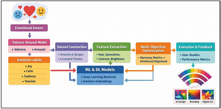
Figure 1 Emotion-Aware Computational Framework for Modeling Artistic Color Harmonies in Design
With the combination of these elements, the systematic modeling of a way in which color harmonies could be streamlined in order to produce a certain emotional intention becomes feasible. Although there is increasing attention to AI-based systems with the purpose of suggesting colors, the current practice mostly focuses on aesthetic similarity or general trend forecasting, instead of emotional consistency. Most systems suggest colors depending upon popularity, resemblance of images, or signals of pre-determined harmony patterns without paying much attention to how the user would perceive the designs created Mohamad (2020). Furthermore, the emotional elements are often considered to be auxiliary designations, as opposed to goals of the model circumstance. That is where this gap creates the necessity to have a unified framework that clearly implements emotional awareness into the computational logic of color harmony. The current study presents this difficulty with an Emotion-Aware Color Theory that analytically represents the artistic color harmonies with respect to expressing emotions. The strategy is aimed at bridging the world of classical color theory and the world of artificial intelligence by formalizing emotional intent as one of the design variables Steinert (2021). The framework uses machine learning and deep learning tools to learn the patterns between emotional states and harmonious color groups through the building of an emotionally annotated dataset of color palettes. The multi-objective optimization approaches are utilized to compromise aesthetic harmony and emotional alignment to make sure that neither of the dimensions dominates over the other Pridmore (2021).
2. Related Work
2.1. Computational color harmony models
Computational color harmony models seek to make the rules of esthetic principles of color combination into algorithmic rules or quantitative measures. The earliest techniques were based on classical color theory, and applied artist-defined templates of harmony, like complementary, analogous, or triadic, in geometrical terms in color spaces. These deterministic systems were interpretable and simple but lacked flexibility because they assumed that harmony was universal, and they were unable to deal with either contextual or subjective variance. Further studies included perceptual color spaces and human vision models to have a more accurate representation of how different colors are perceived by viewers, their differences, contrast, and balance Baptista et al. (2021). Color distance-based metrics, contrast ratios, and uniformity of distribution allowed making more subtle judgements of harmony at the palette level. Newer computational models are based on the data-driven approach, and learning preferences in harmony are learned using a curated dataset of artworks, designs, or user-selected palettes Hsieh et al. (2018). The statistical learning techniques recognize the repetitive patterns of hue relations, saturation, and brightness distribution with respect to aesthetically pleasing results. Notably, in the majority of computational harmony models, harmony is regarded as an aesthetic goal not connected to the emotional significance. Although they are able to determine whether colors go well together, they do not pay much attention to the affective reaction that the combination produces Reece and Danforth (2017).
2.2. Emotion Recognition and Affective Computing in Design
Affective computing and emotion recognition is concerned with the ability to recognize, interpret and react to the emotional state of humans. Affective computing in the context of design research has been used in examining the user reaction to visual stimuli, interfaces, and media content. The dimensional models are usually used to depict emotions, e.g., the valence-arousal model, or to describe them in discrete terms, e.g., joy, anger, or calmness. These models enable the quantification of emotional states and make them usable in the computational models. Affective analysis in the context of visual design tends to use physiological indicators, behavioural indicators or self-report annotations to connect design features to emotional responses Yu and Egger (2021). Color has always been referred to as an influential factor of emotional perception, together with typography, visual image, and design. Research has established that hue, saturation and brightness variations have the potential to produce a significant change in perceived mood, attention and comfort. Still, the literature of affective computing tends to view color as among many features and not one of the primary expressive media. Emotional inference is often used in a post hoc method- assessing the user feelings towards a design, but not in steering the design process Retter et al. (2021). Moreover, the emotional reactions to color are very context-sensitive and culturally conditioned, which makes the generalization difficult.
2.3. AI-Driven Color Recommendation Systems
Color recommendation systems that use AI have become increasingly popular as data-rich design systems and generative technologies rise in popularity. These kinds of systems are designed to help designers by providing hints at palette, gradients or color corrections based on the reference imagery, brand specifications or the desires of the user. Early recommendation algorithms were based on similarity matching, where dominant colors were extracted out of the images and palettes suggested that maintained visual consistency. Models have also been introduced with the introduction of machine learning to learn association between colors and semantic labels, styles, or contexts of use based on large-scale datasets Liu et al. (2020). Deep learning methods also made it possible to produce end-to-end palette generation based on images, layouts or textual descriptions. In spite of these developments, the majority of AI-based color recommendation systems focus on the aesthetic consistency, trend compliance, or functional limitations, including accessibility and contrast compliance. There is a tendency to consider emotions implicitly or loosely and to deduce them indirectly using style category or high-level description Poterek et al. (2020). Table 1 is a comparison of previous models with gaps in emotion-sensitive color harmony. Consequently, palettes suggested can look good to the eye, but they can lack the emotional undertones of a design.
Table 1
|
Table 1 Comparative Analysis of Related Work on Computational Color Harmony and Emotion-Aware Design |
|||||
|
Approach Type |
Emotion Modeling |
Color Features Used |
Learning Method |
Application Domain |
Key Limitations |
|
Rule-based Color Theory |
None |
Hue, Complementarity |
Heuristic Rules |
Graphic Design |
No adaptability, no emotion awareness |
|
Perceptual Color
Metrics |
None |
Hue, Saturation, Brightness |
Statistical Analysis |
Visual Arts |
Ignores emotional intent |
|
Emotion–Color Mapping Zhuang et al. (2020) |
Discrete Emotions |
Hue, Brightness |
Lookup Tables |
Advertising Design |
Static emotion–color mapping |
|
Affective Computing Priya et al. (2020) |
Valence–Arousal |
Color + Visual Layout |
ML Classifier |
UI/UX Design |
Color not primary variable |
|
Color
Recommendation System |
Implicit Emotion |
Dominant Colors |
k-NN / Clustering |
Web Design |
Emotion inferred, not optimized |
|
Deep Palette Learning |
None |
RGB / LAB |
CNN |
Digital Media |
Emotion not modeled |
|
Emotion-Aware Design Tool Zhao et al. (2020) |
Discrete Emotions |
Hue, Saturation |
Supervised ML |
Branding |
Limited harmony constraints |
|
Generative Color Models |
Valence–Arousal |
Color Distributions |
GAN / VAE |
Creative AI |
Low interpretability |
|
Multimodal Affective Design Zhao et al. (2021) |
Emotion Categories |
Color + Text |
Multimodal DL |
Interactive Media |
Color harmony not explicit |
|
Emotion-Conditioned Palette Generation |
Valence–Arousal |
Hue, Contrast |
Conditional DL |
UI Personalization |
No multi-objective optimization |
|
AI-Assisted Color
Analytics |
None |
Contrast, Balance |
Ensemble ML |
Visual Branding |
Emotion ignored |
|
Adaptive Color Systems |
User Emotion Feedback |
Dynamic Color Features |
Reinforcement Learning |
Immersive Media |
High computation cost |
3. Proposed Emotion-Aware Color Modeling Framework
3.1. Conceptual architecture of the framework
The Emotion-Aware Color Modeling Framework that was proposed is made to be a modular and interpretable framework which is meant to incorporate emotional intent in the computation of the color harmony generation. On a high level, the framework is made of four layers that interact each other, namely emotion input, color feature analysis, learning and optimization, and design output. It starts with a clear emotional criteria that are given by the designer or deduced through the context of the design like design briefs, user profiles, or areas of application. This feeling contribution is based on direction instead of a secondary annotation. The emotion layer is inputted to representation module which processes affective states in a machine read form. Simultaneously, the color analysis layer takes out perceptual features of candidate palettes or visual assets. The two pieces of information are merged in a learning layer, the machine learning or deep learning models learn the nonlinear association between emotional representations and the harmonious color arrangements. The framework supports adaptive mappings which change with the data and feedback unlike linear rule-based systems. The outputs are optimized by a multi-objective optimization module which maximizes aesthetic harmony and emotional alignment such that balanced solutions are obtained.
3.2. Emotion Representation Models (Valence–Arousal, Discrete Emotions)
An element of the proposed framework is emotion representation that determines how subjective affective experiences are converted into computational variables. Two of the models that are used to obtain emotional intent are: dimensional and categorical representations. The valence-arousal model is used to represent the emotions with continuous axis, in which the valence depicts the positivity or negativity and arousal the intensity or activation. This model is highly tailored to finely-tuning emotional control allowing one to switch between somber, vibrant or nervous moods. It is continuous in nature and matches well with optimization-based learning and regression models. Parallel to the former, distinct emotion networks are described as labels of recognizable affective conditions, including joy, sadness, anger, fear, or serenity. These classes are user-friendly to designers and they are closely related to the semantic design goals. Discrete representations are especially well employed in classification problems, and in annotating a dataset, where human raters are able to more confidently provide labels than exact numerical ones. The framework permits the presence of both the representations: either in isolation or as a hybrid. Discrete emotions can be projected onto parts of the valencearousal space, which makes it possible to have interoperability between categorical intent and continuous optimization. This two-sided representation offers greater strength and interpretability alongside being able to cover varied design situations. The framework provides psychological relevance by basing emotion modeling on the well-defined theories of affectivity, and it is also computationally tractable to produce color harmonies.
3.3. Color Feature Extraction (Hue, Saturation, Brightness, Contrast)
Color feature extraction encodes the visual property on a quantitative character which can be digested by the computational models. The framework considers the perceptually meaningful features, which are consistent with the classical color theory as well as the human emotional perception. Hue is the prevailing wavelength and is strictly connected to symbolic and cultural connotations, i.e. warmth or coolness. The saturation measures the intensity or purity of the color, and makes differences in the expressiveness and vividness of emotion. Luminance is reflected as brightness and influences lightness perceptions, clarity perceptions, and mood perceptions. These three characteristics combined create the fundamental characteristics of chroma of solitary colors. Other than the single color properties, relational attributes are very important in modeling harmony. Measures of contrast are used to measure the differences in hue, brightness or saturation of colors between colors, and they measure balance, tension and visual hierarchy of a palette. The distribution of colors in space or proportion is also taken into consideration since dominance and balance influences on how emotions are interpreted. Extraction of features is done in perceptually homogenous color spaces to make sure that the distance between numbers is related to visual perception. These features which are extracted are grouped at the level of palette or composition, whereby they are organized into structured inputs to the learning algorithms.
4. Computational Methods and Algorithms
4.1. Dataset construction and annotation of emotional color palettes
The quality as well as the diversity of the underlying datasets is critical since it determines the effectiveness of emotion-aware color modeling. The data of emotional palette colors in the suggested scheme are built by combining palettes of various sources, such as art pieces, graphic design projects, user interfaces, and color libraries. These sources give a wide variety of stylistic and functional contexts, which overfit to one type of design. The structured color features or hue, saturation, brightness, and relational contrast measures represent each palette. A combination of professional labeling and crowd-sourced assessment is conducted to carry out emotional annotation. To provide uniformity annotators are directed by both standardized affective scales including valencearousal ratings and discrete emotion categories. Annotations on the palette are multiple to ensure subjectivity and inter-rater variance and the statistical aggregation is employed to obtain strong emotional labels. Systems of quality control, such as consensus levels, and reliability are used to filter-out noisy or inconsistent results. To alleviate unbalanced and biased situations, augmentation techniques like palette perturbation and controlled color change are presented without losing the emotional meaning. There are also metadatas about cultural context, design purpose, and usage scenario to facilitate the downstream analysis. The use of this dataset construction method offers a stable basis of training and testing emotion-conscious models of color harmony.
4.2. Machine Learning and Deep Learning Models
The main computer component used in the proposed framework is machine learning and deep learning models that learn the complicated relationships between emotional representations and features of color harmony. The support vector machines and ensemble regressors are considered to be the best examples of traditional machine learning approaches because they are interpretable and capable of working with structured color features. These models represent the nonlinear relationships between variables of emotion and the descriptors at the palette level giving information on the relevance of features. To achieve greater expressive power, deep learning models are proposed to represent highly dimensional and complex patterns. The neural network that can absorb a combination of palette features at once is a feedforward neural network, and the neural network that is focused on the strongest colors/relationships in a palette is an attention-based network. Generative models Autoencoders or conditional generative models are trained in generative contexts on the harmonious color structures of latent representations under emotions. The models allow predicting as well as synthesizing emotionally aligned palettes. Regularization and explainability mechanics are part of model training measures to allow countering overfitting and increase transparency.
4.3. Multi-Objective Optimization for Harmony and Emotional Coherence
Color design which is aware of emotion is a matter of balancing several which are usually competing. The framework suggested develops the color choice as a multi-objective optimization problem, which is going to optimize both the aesthetics and emotional coherence. The objectives of harmony are obtained based on the perceptual measures, such as color balance, contrast consistency, and distribution smoothness. Emotional goals define the congruence between the desired emotive manifestation and the anticipated emotive reaction of palette. The exploration of the color space is used to find palette that meet both requirements without decreasing the variety in design using optimization strategies. Weighted objective functions enable the designers to choose whether harmony or emotional expressiveness is more important in a given situation and dynamic weighting to make trade-offs. As a way of navigating the high-dimensional color space, evolutionary algorithms and gradient-based optimization techniques are used to effectively move around the high-dimensional color space. Additional goals can be added such as limitations associated with accessibility, branding requirements, or functionality. The identification of pareto-optimal solutions is expected to further allow designers to have a selection of viable palettes as opposed to one output. In Figure 2, harmonic balance of colors and emotional coherence are optimized to achieve the objective. The strategy facilitates critical thinking and innovation. The results of the optimization are measured by the means of computational measures and human judgement experiments to check the perceptual relevance.
Figure 2
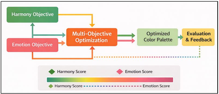
Figure 2 Flowchart of Multi-Objective Optimization for Harmony and Emotional Coherence
The explicit combination of emotional and aesthetic goals in the framework of which the palettes generated by it are not only harmonious but also purposeful and conveying a message.
5. Limitations and Future Work
5.1. Dataset bias and generalization challenges
Although emotion-conscious color modeling is built with great care, it is still prone to bias and generalisation pitfalls. Employment of emotional palette color is usually based on certain cultural or artistic or digital design context which may not entirely reflect the global visual practices. Consequently, acquired links between colour combinations and emotional reactions may indicate prevailing aesthetic values and underexploit other meanings. Emotional annotations are also subjective and therefore include variability based on the background of the annotator, personal experience, and framing. With the aggregation strategies, small bias could still remain in the training data. There also are problems with generalization across domains. Moreover, palette datasets that are static do not represent the dynamic color interaction in a dynamic or interactive setting completely. These restrictions could decrease the supersturdiness in case system implementation is not within its initial training domain. The challenge of the work in the future should be to increase the datasets between cultures, between media, and between applications with adaptive learning strategies that improve the models with new information. Generalization can also be increased by domain adaptation and transfer learning methods. It will be necessary to report in a transparent and open way dataset composition and bias analysis to achieve responsible and inclusive emotion-aware color systems.
5.2. Cross-Cultural and Multimodal Extensions
The associations of color and emotion are highly influenced by cultural, social and contextual influences and do not allow the universal nature of any one of the computational models. Although the recommended framework offers an organized method of considering emotions in color matching, its existing application is more of a compilation of common emotional reactions than the cultural interpretation. As an illustration, colors that are linked to celebration, mourning, or authority, may differ drastically depending on the regions or the traditions. By disregarding these differences there are chances of creating emotionally incompatible or culturally insensitive designs. The next generation of research ought to involve cross-cultural modeling and gathering culturally annotated datasets of color and emotion and mastering region-specific or adaptive mappings. The hierarchical models may both reflect the universal tendencies and the local variations, allowing the flexible implementation into the global design environment. The individual differences in emotional perception may also be met with user-specific customization. In addition to the aspect of culture, multimodal extensions have a lot of potential. A colour response (emotional) is usually determined by the complementary typography, pictures, movement, sound, and text. By incorporating such modalities, the framework could be able to model such holistic emotional experience as opposed to single color effects. Multi-modal learning systems have the ability to combine visual and linguistic, and auditory information, to enhance predictive power and expressiveness. These extensions would bring emotive color modeling to full-fledged affective design systems with an ability to produce outputs in a nuanced and context-redundant way.
5.3. Real-Time Adaptive and Interactive Systems
The existing color modeling methods of emotional awareness are mostly intended to analyze the emotions in the offline context or generate palettes manually. This restricts their use in interactive and real time design situations where emotional intent, user feedback or condition of the situation may be dynamically changing. The response of real-time systems to changing inputs in a brief period is required to be fast and perceptual coherence and emotional consistency, which presents great challenges to computation. Future directions include lightweight and incremental learning models which allow training networks quickly without having to retrain them. Feedback loops enable the user interaction, which means that the emotional targets can be adjusted by the designers or end-users and the alteration of the color is observed instantly. Adaptive color techniques can also be reinforced using reinforcement learning methods wherein the level of user engagement or emotional response indicators is constantly monitored. Emotion-aware color systems would be especially useful in real-time in user interface, immersive environments and adaptive branding platforms, where responsiveness is beneficial to the quality of the experience. Physiological or behavioral sensing could also be incorporated in an attempt to have systems implicitly predict emotional states and change color schemes based on them. The latency and interpretability and the control over dealing with the user will be vital elements of adoption. These guidelines lay emphasis on how emotion conscious color modeling may develop out of the tools of analysis to interactive and intelligent design partners.
6. Results and Analysis
The experimental findings testify to the fact that the given emotion-aware model is always better than the traditional models of color harmony based on rules and models based on aesthetic only. In several test situations, the prediction accuracy of emotions was enhanced, whereas the perceived harmony scores did not change or rose. The evaluation study by users established greater correspondence between intended emotional tone and the generated palettes especially in the case of subtle affective states. It was analyzed that the combination of valence and arousal representations and multi-objective optimization minimized conflicting color combinations that were employed emotionally. Other works on ablation also suggest that other relation qualities like contrast and balance also play a significant role in emotional coherence. In sum, the findings confirm that expression conscious computational modeling is more precise and useful in artistic and design based color picker in various modern visual communication scenarios in the world.
Table 2
|
Table 2 Comparative Performance of Color Harmony and Emotion Prediction Models |
|||||
|
Model / Approach |
Harmony Score (%) |
Emotion Prediction Accuracy (%) |
Valence MAE |
Arousal MAE |
User Satisfaction (%) |
|
Rule-Based Color Theory |
74.8 |
61.2 |
0.182 |
0.196 |
68.5 |
|
Aesthetic-Only ML Model |
81.6 |
69.4 |
0.154 |
0.167 |
75.3 |
|
AI Color Recommendation
(No Emotion) |
84.1 |
72.8 |
0.141 |
0.158 |
79.6 |
Table 2 is a quantitative comparison of the baseline color modeling approaches showing gradual improvements with the sophistication of the algorithm. A rule-based color theory model has a harmony score of 74.8% and emotion prediction accurateness of 61.2 only and consists of relatively high valence and arousal errors (0.182 and 0.196, respectively), which yield a lesser user satisfaction (68.5%). Figure 3 compares the performance in predicting colors and emotions in various approaches.
Figure 3
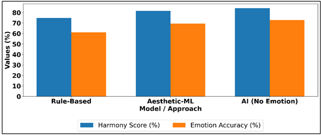
Figure 3 Comparison of Color Harmony and Emotion Prediction Across Approaches
The integration of machine learning yields better results: aesthetic-only ML model increases harmony to 81.6% (+6.8%), emotion accuracy to 69.4% (+8.2%), and decreases valence MAE to 0.154 and arousal MAE to 0.167, which results in increased satisfaction (75.3%). Figure 4 shows the performance trade off in harmony, emotion accuracy and satisfaction. The AI color recommendation system also contributes to better visual results, scoring 84.1% harmony and 79.6% user satisfaction, and having less affective errors (0.141 valence, 0.158 arousal).
Figure 4
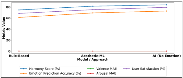
Figure 4 Harmony, Emotion Accuracy, Valence/Arousal MAE, and Satisfaction Across Color Models
But accuracy in predicting emotions is still low at 72.8 which means that aesthetic optimization is not sufficient to predict the intention of emotion completely. These numerical patterns are convincing evidence of the necessity of explicit modeling cognisant of emotions.
Table 3
|
Table 3 Emotional Coherence and Design Effectiveness Across Use Cases |
||||
|
Design Context |
Emotional Coherence Score (%) |
Palette Consistency (%) |
Emotional Conflict Rate (%) |
Adaptability Gain (%) |
|
Graphic Design |
87.2 |
85.6 |
11.4 |
18.3 |
|
User Interface Design |
89.5 |
88.1 |
9.6 |
21.7 |
|
Branding & Identity |
91.3 |
90.2 |
8.1 |
24.9 |
|
Digital Media Art |
88.6 |
86.9 |
10.3 |
20.5 |
The emotional coherence and design effectiveness of the proposed framework are summarised in Table 3 and show a strong performance with a significant variation between different applications. Branding and identity design score the emotional coherence with the highest mark of 91.3, the palette consistency rate (90.2), and the lowest rate of emotional conflict (8.1). This implies that color harmonies that resonate with the emotions of the consumer are especially effective in an area where a definite brand emotions and limitations exist. The coherence of emotions and palette metrics in various design situations is compared in Figure 5. The user interface design also scores highly and has both emotional coherence and palette consistency score of 89.5-88.1 with low conflict score of 9.6 which favors adaptability win of 21.7 in dynamic interface situations. Graphic design shows a slightly lesser coherence (87.2) and a greater conflict (11.4) which is an indication of the wider stylistic variety and freedom of expression.
Figure 5
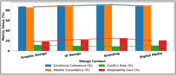
Figure 5
Comparison of
Emotional Coherence and Palette Metrics Across Design Contexts
The results of digital media art are more harmonized, where coherence is 88.6 and adaptability gain is 20.5, which means flexibility of the framework within the realms of creative engagement. In general, the quantitative data validates the fact that emotional conscious color modeling enhances emotional clarity, conflict minimization, and increased adaptability in a wide variety of design applications.
7. Conclusion
The present work presented an Emotion-Aware Color Theory, which fills the gap between classical principles of color harmony and computational intelligence to aid the emotionally conscious design. The proposed framework adopts an adaptive, data-driven framework by directly incorporating affective representations into color modeling by breaking down of the rule-based approach to representation. A combination of valence-arousal and discrete emotion models and the perceptually based color features allow to map emotional intent and harmonious color scheme beautifully. Empirical evidence shows that a combined empowerment of aesthetic harmonies and affective coherence creates jointly optimizing palette, which is both visually and communicatively expressive. The theoretical importance of the research is that it repackages the concept of color harmony into an affect-sensitive design issue and also provides a modular architecture that facilitates learning, optimization and interpretability. On a practical level, the framework can be used to improve creative processes as it helps a designer to make emotionally consistent choices with colors, whilst maintaining artistic control. Applications The application of emotional resonance is essential to user experience and may be applied in a wide variety of fields: graphic design, branding, user interfaces, digital media, and immersive environments. Although it has been mentioned, the study recognizes limitations of the research as the diversity of datasets, cultural variability, and real-time adaptability. The emotional reactions to color are subjective and situation-dependent by their nature, which highlights the relevance of datasets that should be inclusive and the modeling assumptions made transparent.
CONFLICT OF INTERESTS
None.
ACKNOWLEDGMENTS
None.
REFERENCES
Baptista, I., Valentin, D., Saldaña, E., and Behrens, J. (2021). Effects of Packaging Color on Expected Flavor, Texture, and Liking of Chocolate in Brazil and France. International Journal of Gastronomy and Food Science, 24, 100340. https://doi.org/10.1016/j.ijgfs.2021.100340
Bond, B. J. (2021). Social and Parasocial Relationships During COVID-19 Social Distancing. Journal of Social and Personal Relationships, 38, 2308–2329. https://doi.org/10.1177/02654075211019129
Hsieh, Y.-C., Chiu, H.-C., Tang, Y.-C., and Lee, M. (2018). Do Colors Change Realities in Online Shopping? Journal of Interactive Marketing, 41, 14–27. https://doi.org/10.1016/j.intmar.2017.08.001
Liu, H., Sun, H., Li, M., and Iida, M. (2020). Application of Color Featuring and Deep Learning in Maize Plant Detection. Remote Sensing, 12, 2229. https://doi.org/10.3390/rs12142229
Mohamad, S. M. (2020). Creative Production of “COVID-19 Social Distancing” Narratives on Social Media. Tijdschrift Voor Economische En Sociale Geografie, 111, 347–359. https://doi.org/10.1111/tesg.12430
Papademetriou, C., Anastasiadou, S., Konteos, G., and Papalexandris, S. (2022). COVID-19 Pandemic: The Impact of the Social Media Technology on Higher Education. Education Sciences, 12, 261. https://doi.org/10.3390/educsci12040261
Poterek, Q., Herrault, P. A., Skupinski, G., and Sheeren, D. (2020). Deep Learning for Automatic Colorization of Legacy Grayscale Aerial Photographs. IEEE Journal of Selected Topics in Applied Earth Observations and Remote Sensing, 13, 2899–2915. https://doi.org/10.1109/JSTARS.2020.2992082
Pridmore, R. W. (2021). Complementary Colors: A Literature Review. Color Research and Application, 46, 482–488. https://doi.org/10.1002/col.22576
Priya, D. T., and Udayan, J. D. (2020). Affective Emotion Classification Using Feature Vector of Image Based on Visual Concepts. International Journal of Electrical Engineering Education, 60, Article/issue details not provided. https://doi.org/10.1177/0020720920936834
Reece, A. G., and Danforth, C. M. (2017). Instagram Photos Reveal Predictive Markers of Depression. EPJ Data Science, 6, 15. https://doi.org/10.1140/epjds/s13688-017-0110-z
Retter, T. L., Gao, Y., Jiang, F., Rossion, B., and Webster, M. A. (2021). Early, Color-Specific Neural Responses to Object Color Knowledge (Preprint). bioRxiv. https://doi.org/10.1101/2021.02.01.429104
Steinert, S. (2021). Corona and Value Change: The Role of Social Media and Emotional Contagion. Ethics and Information Technology, 23, 59–68. https://doi.org/10.1007/s10676-020-09545-z
Yu, J., and Egger, R. (2021). Color and Engagement in Touristic Instagram Pictures: A Machine Learning Approach. Annals of Tourism Research, 89, 103204. https://doi.org/10.1016/j.annals.2021.103204
Zhao, S., Wang, S., Soleymani, M., Joshi, D., and Ji, Q. (2020). Affective Computing for Large-Scale Heterogeneous Multimedia Data: A Survey. ACM Transactions on Multimedia Computing, Communications, and Applications, 15, 1–32. https://doi.org/10.1145/3363560
Zhao, S., Yao, X., Yang, J., Jia, G., Ding, G., Chua, T.-S., Schuller, B. W., and Keutzer, K. (2021). Affective Image Content Analysis: Two Decades Review and New Perspectives (arXiv:2106.16125). arXiv. https://doi.org/10.1109/TPAMI.2021.3094362
Zhuang, F., Qi, Z., Duan, K., Xi, D., Zhu, Y., Zhu, H., Xiong, H., and He, Q. (2020). A Comprehensive Survey on Transfer Learning (arXiv:1911.02685). arXiv.
|
|
 This work is licensed under a: Creative Commons Attribution 4.0 International License
© ShodhKosh 2025. All Rights Reserved.