ShodhKosh: Journal of Visual and Performing ArtsISSN (Online): 2582-7472
|
|
EXPLORING THE INTERSECTION OF CHROMOTHERAPY AND FASHION-FORWARD THINKING
Apeksha Tallaml
1![]()
![]() ,
Mokanaa Sri E 2
,
Mokanaa Sri E 2![]()
![]()
1 Bachelor
Student, School of Arts and Design, Woxsen
University, Hyderabad, Telangana, India
2 Research
Scholar, Department of Fashion Design, School of Arts and Design, Woxsen University, Hyderabad, Telangana, India
|
|
|
ABSTRACT |
|
|
Chromotherapy,
often known as colour therapy, has profound
therapeutic, psychological, and spiritual implications that impact people's
feelings, actions, and general well being. This
article explores the complex interrelationship between colour
and fashion, looking at its theoretical foundations, historical antecedents,
and real-world applications. Chemotherapy has used colour
to aid healing and harmony since ancient times. According to the field of
fashion psychology, colour is essential for
communicating emotional, political, and social themes as well as for defining
personal style and society conventions. Textile colour
symbolism represents cultural values and identities from many countries and
eras, underscoring Colour's continuous significance
in fashion. Furthermore, people are using colour
therapy into their personal styling and wardrobe selections more and more,
taking use of its psychological benefits to improve their mood and sense of
self. The notion of "dopamine dressing," which highlights how
clothes can elevate one's mood, highlights the healing effects of clothing colour choices. This paper provides a qualitative
analysis of the topic and examines how color therapy has developed,
especially with regard to photochromic dye in
Textile materials. It also consists the secondary
sources, the topics Swhich includes healing
properties of a colour, application methods,
opportunity in chromotherapy in future. This research focuses on the
effectiveness of chromotherapy on textile materials through visual
examination and customers questionnaires evaluating colors and their
relationship with emotions. |
|||
|
Received 11 April 2024 Accepted 22 June 2024 Published 29 June 2024 Corresponding Author Mokanaa Sri E, mokanaadevreddy.98@gmail.com
DOI 10.29121/shodhkosh.v5.i1.2024.1092 Funding: This research
received no specific grant from any funding agency in the public, commercial,
or not-for-profit sectors. Copyright: © 2024 The
Author(s). This work is licensed under a Creative Commons
Attribution 4.0 International License. With the
license CC-BY, authors retain the copyright, allowing anyone to download,
reuse, re-print, modify, distribute, and/or copy their contribution. The work
must be properly attributed to its author.
|
|||
|
Keywords: Fashion, 7-Chakras, Colour
Psychology, Chromotherapy, Consumer Behaviour,
Photochromic Dye, Therapeutic Benefits |
|||

1. INTRODUCTION TO CHROMOTHERAPY
Colour has deep psychological, spiritual, and therapeutic
meaning that extends well beyond its aesthetic value. Colour
is strongly ingrained in human society, influencing not only fashion choices
but also therapeutic approaches from ancient civilizations to modern
procedures. The use of coloured light in
chromotherapy, which has roots in ancient cultures, helps the body heal and
reestablish balance. Because it is linked to mysticism and pseudoscience,
despite its historical significance, it has frequently been viewed with scepticism. Supporters claim it is effective in balancing
body energy, but there isn't enough scientific proof to back up these claims,
thus it's still controversial, especially among mainstream medical experts. According
to fashion psychology, colour is essential for
expressing social, political, and emotional themes as well as defining
individual style. Colours have been given distinct
meanings throughout history and culture, influencing fashion and social mores.
Through an understanding of colour psychology,
designers can effectively use clothing to elicit desired feelings and messages,
changing people's perceptions and actions Radin (2019).
Colour symbolism in textiles and embellishments has been used
by many societies as a means of expressing their cultures through clothes
throughout history. Colours have always represented
ideas, feelings, and social classes, from ancient Egypt to Greece and India. In
the Byzantine era, purple, for example, denoted monarchy, whereas in ancient
Greece, gold and yellow stood for divine connotations. Fashion designers and
consumers alike are still motivated by colour therapy
in the modern period, which allows for conscious colour
selections in apparel to promote emotional resonance and self-expression. Not
to mention, colour therapy is becoming known as an
additional strategy for lowering stress and raising vitality Wylde (2016).
Figure 1
|
Figure 1 Chromotherapy & 7 - Chakras Source
yummymummykitchen.com |
2.
REVIEW LITERATURE
2.1. Mechanistic and Theoretical Basis of Chromotherapy
Chromotherapy, sometimes referred to as colour therapy, treats a variety of
diseases and ailments by using visible light wavelengths. The idea of colour
frequencies and how they affect the body and mind is the basis of this
treatment. Studies are being conducted to comprehend how these wavelengths
interact with molecules and cells. Chemotherapy may help with relaxation and
lessen anxiety, according to studies. Using the therapeutic qualities of
colour, this all-encompassing method seeks to enhance mental, emotional, and
spiritual well being. Because different colours
elicit varied psychological and emotional reactions, therapists use intentional
colour manipulation to impact mood, behaviour, and general health Rolfe (2023).
However, historians and medical professionals view chromotherapy as quack medicine and pseudoscience. Despite the lack of evidence linking particular colours to emotional or mental states, some ayurvedic doctors maintain that the body's seven "chakras" can become unbalanced and lead to physical and mental illnesses. These imbalances are said to be corrected by applying the appropriate colour Ohwovoriole (2024)
Chromotherapy is a technique that uses colour to balance the body and restore a person's mental, emotional, spiritual, or physical energy. Colour therapy can be used to improve mood, reduce stress, control anxiety, manage pain, and improve the quality of sleep. However, chromotherapy is viewed as quack medicine and pseudoscience by historians and medical professionals, and there is no proof that any particular colour is associated with particular emotional or mental states World (2023).
A form of complementary medicine called chromotherapy also referred to as colour therapy uses electromagnetic radiation in the visible spectrum to treat a variety of conditions. Its tenets centre on the assumed effects of these radiations on cellular function, and its explanations aim to clarify the therapeutic mechanisms at work. Recent advances in photobiology (a branch of biology that deals with the effects on living organisms of radiant energy (such as light)) and photobiomodulation (form of light therapy that utilizes non-ionizing forms of light sources including LASERS, LEDs, and broadband light, in the visible and near infrared spectrum) explore the molecular and cellular effects of electromagnetic radiation in the visible range, providing insight into possible treatment approaches. Certain colours are thought to cause physiological reactions, including elevated blood pressure, increased metabolism, and eyestrain. By historians and medical professionals alike, chromotherapy is still mostly dismissed as pseudoscience and quack medicine, despite its historical relevance and some scientific investigations into its workings. Among the most important contributions to the discussion of chromotherapy and related topics is Edwin Babbitt's groundbreaking work, "Principles of Light and Colour," which is a foundational treatise that explains the basic ideas about light and colour Ohwovoriole (2024).
2.2. Effectiveness of Chromotherapy on Mood and Wellness
The complex effects of the chromatic spectrum on human emotions and well-being have drawn a lot of interest from psychologists and physiological scientists. Warm Colours such as the vivid range of red among these tones elicit a complex reaction in people that extends beyond visual perception to affect the physiological and cognitive domains. These tones are thought to stimulate mental activity and appetite, creating a dynamic interaction between sensory inputs and cognitive processes. They are distinguished by their greater wavelength and perceived energetic properties.
The cool end of the colour spectrum, which is best represented by serene blue and green tones, presents a different experience landscape. These colour expressions are frequently praised for their alleged ability to promote peace and tranquilly, especially among people who are experiencing stress or worry. This phenomena, which has its roots in colour psychology, is supported by the perceptions that people have of cool colours in relation to natural elements like water and greenery, which have long been associated with rebirth and rejuvenation in human consciousness How Colour can Affect Your Mood: All About Colours and Emotions - 2024. MasterClass. (2022b).
The complex interaction between cold and warm hues highlights a dialectic relationship in which visual cues have a significant impact on both emotional and mental states. This link goes much beyond aesthetics; it affects many aspects of the human condition and experience. Thus, comprehending the distinct effects of particular colours on affective and cognitive domains not only clarifies the intricate fabric of human perception but also has consequences for other domains, such as therapeutic interventions and environmental design. Thorough scientific investigation is essential to properly understand the extent of its possible advantages and disadvantages. In order to create standardized procedures and recommendations and to enable a better knowledge of how colour therapy can be most effectively incorporated into medical practices, extensive study is required. These kinds of initiatives will not only increase credibility but also guarantee the safe and efficient application of colour therapy as an alternative or complementary treatment strategy in a variety of healthcare settings Stanton (n.d.).
2.2.1. Advantages
1) Tension Reduction: People are said to be able to relax and reduce tension by the calming effects of certain colours.
2) Enhancing Appetite: Certain hues have the ability to increase appetite. For example, warm hues like orange and red are believed to do so.
3) Mood enhancement: A variety of emotions are connected to different colours. For instance, yellow is frequently associated with joy and optimism.
2.2.2. Uses
1) Light therapy: A variety of illnesses can be treated by exposing patients to particular colours of light. Red light treatment is used to repair wounds and relieve pain, whereas blue light therapy is used to treat seasonal affective disorder (SAD).
2) Visualizations: To elicit desired emotional or physical reactions, visualization techniques entail envisioning oneself surrounded by particular colours.
3) Coloured Clothes: Throughout the day, your attitude and level of energy can be affected by the colours you wear.
2.2.3. Potential Consideration
1) Individual Variability: Each person may react differently to colour therapy. One person's solution might not be another.
2) Research Limitations: Although anecdotal evidence suggests that colour therapy helps, more thorough scientific research is required to confirm colour therapy's efficacy for a range of medical issues.
3) Integration with other Therapies: Rather than being a stand-alone treatment, colour therapy is frequently used in conjunction with traditional medical therapies Brognano (2023).
2.3. Colours and their Healing Properties
2.3.1. Red
Red is significant in many ways; it is energetic and exciting in addition to having medicinal uses and symbolic meanings. Warmth and security are evoked by the colour red, which is well-known for being associated with energy, passion, strength, courage, and creativity. It is used in holistic medicine to treat low blood pressure and weariness by using its natural warmth to ward off illnesses and revitalize the body. Red is symbolic of passion, strength, and a desire for financial ambition; these traits are sometimes combined with an emphasis on sensuous pleasures and a tendency towards impulsive behaviour.
Moreover, red is a colour that is widely used in fashion, especially on evening wear and statement pieces. Its vivid colour gives clothing depth and attraction while acting as a visual representation of its passionate and energizing meanings. Red is a timeless colour for anyone looking to make a statement because it draws attention and radiates confidence in both haute couture and informal ensembles. Essentially, red is more than just a colour; it represents a range of connotations, from vitality and healing to style and symbolism, enhancing both the material and spiritual spheres of human existence Design (2019).
2.3.2. Orange
1) Symbolism and Trends in Fashion: Orange is more than just a hue; it represents vivacity, warmth, and innovation. Orange is becoming a seasonally-appropriate colour in the fashion industry, showing up in both bold statement pieces and delicate accents. On runways and in street wear, where it acts as a bright beacon of energy, signifying excitement, success, and stimulation, its adaptability and attractiveness are palpable Tracy (2021b).
2) Emotional balance and therapeutic value: Orange has therapeutic significance beyond its visual appeal, especially when it comes to treating emotional imbalances and sadness. Linked to happiness and optimism, it serves as a stimulant to raise spirits and promote emotional balance. This psychological influence carries over to fashion decisions, as the vivid colour can inspire sentiments of confidence and optimism, improving one's general well being Wilson (2023).
3) Manifestation in contemporary fashion trends: Orange appears in a variety of ways in current fashion trends, ranging from monochrome outfits to varied designs. Its warmth is used by designers to create dynamic styles that radiate life and vigour. Orange continues to be a potent colour for emotional resonance and self-expression, whether it is embraced in casual clothes to create a joyful character or integrated into sportswear to evoke resolve.
4) Advantages for Wellness and Health: Orange is connected to joy, pleasure, and sexuality and is associated with the sacral chakra. A robust orange chakra fosters emotional equilibrium and resilience by assisting people in overcoming obstacles in life. Orange is thought to physically stimulate the thyroid, lungs, respiratory system, and digestive system. Additionally, it can encourage curiosity and inventive thinking, which helps with assimilating new concepts.
5) Daily Integration and Colour Therapy: Orange is used in colour therapy to encourage harmony and restore health in the physical, mental, emotional, and spiritual domains of the body. Orange is a stimulating, creative, and encouraging colour that may be incorporated into everyday life through clothes or home design choices, improving general well being and promoting a sense of enthusiasm and vigour.
2.3.3. Yellow
1) The Positive Aura of Yellow: Significance and Symbolism: In psychology as well as fashion, yellow is a colour of hope. It is well known for boosting mood and improving mental clarity. It is the embodiment of joy, hope, and clarity. Yellow has been a favourite colour among designers and fashionistas due to its adaptability. It comes in a variety of hues, from soft and calming to strong and startling, making it a wardrobe essential.
2) Fashion's Versatility: From Summer Chic to Casual: Yellow is a colour that works for all seasons and events in the world of fashion. Whether you're dressing for a summer party or a laid-back day out, yellow always lends an air of sophistication and relaxation to any look. Because of its adaptability, it can fit a variety of tastes and styles by acting as both a subtle accent and a standout piece. Yellow adds life and brightness to any ensemble, whether it be flowy sundresses or casual tees Jana (2023).
3) Fashion Trends: Adoring Yellow Hues: The state of society is frequently reflected in fashion trends, and yellow has become a recurring colour in recent seasons. In particular, yellow dresses have become a summer wardrobe mainstay, providing a cheery and young appearance that exudes happiness and optimism. Totes, umbrellas, jewellery, and shoes are just a few of the accessories that can really make an outfit with a yellow theme stand out. They also offer a clever finishing touch.
4) The Art of Yellow Coordination: A Guide to Styling: Learning to coordinate is crucial when wearing yellow with other colours in your wardrobe. It is possible to create aesthetically pleasing combinations by having a solid understanding of colour theory and the interaction of colours. Outfits with yellow go well together and have a pleasing visual appeal when paired with other shades of the same strength Topping (2022).
2.3.4. Green
Green is a peaceful colour that is frequently used in meditation and introspective techniques because of its quiet attributes. According to popular belief, this colour has the power to balance the mind and help people feel more at ease, accepting, and compassionate. Its potential therapeutic benefits are further supported by its therapeutic effects on a number of physiological systems, including the heart, lungs, and circulation. Green has spiritual importance because it is intimately associated with the heart chakra, which is the body's energy system's centre of love and compassion. Green is thought to encourage harmony and aid in the physical and emotional healing of the heart chakra because of its association with it. Green is a subtle reminder of the value of inner peace, harmony, and compassion, whether it is used in meditation areas, healing settings, or just as part of everyday surrounds. It provides a haven where the body and the mind can find comfort and rejuvenation. Green has seen in a variety of hues recently, including lime, jade, chartreuse, mint and moss. It has also been utilized in tote bags, tiny dresses, cargo pants and silk slip skirts Chwatt (2023).
2.3.5. Blue
1) Blue's symbolic meaning: Genuineness, serenity, and reliability are widely associated with the colour blue. It is widely used in both personal and professional contexts since it exudes stability and serenity.
2) Chakra Healing of the Throat using Blue Crystals: An intense affinity exists between blue stones and the throat chakra, which opens it and improves self-expression and communication. In many physical disorders of the throat, including sore throats, thyroid problems, and strain in the neck and shoulders, they act as catalysts for healing.
3) Physical Properties of Healing: It is very excellent for the throat and surrounding areas. Blue stones are incredibly therapeutic. They help calm people and lower their chance of common illnesses like fevers and colds. They also help relieve discomforts including migraines, earaches, and muscle tension Lorenmtaylor. (2023).
4) Peace of Mind and Spirit: Blue gemstones have a healing effect on the emotional and spiritual levels in addition to the physical. They are thought to soothe individuals suffering from anxiety and sleep issues by having a relaxing impact on the spiritual system. They promote internal harmony and balance with their calm energy.
5) Blue in Clothing and Significance: The healing properties of blue extend to the world of fashion and symbolism. Blue is a popular colour for professional and formal wear, bolstering a sense of dependability and integrity. It is frequently picked for its associations with sincerity and trust Larkin (2021).
2.3.6. Indigo
The colour indigo, which is rich in spiritual and symbolic meaning, facilitates healing and personal development. Its essence has a deep resonance with the chakra of the third eye, directing people towards purpose and clarity when faced with emotional obstacles.
1) Indigo
Crystals Mystical Energy: Instruments for Spiritual Mastery
Indigo-charged crystals hold a wealth of spiritual knowledge and prosperity.
These crystals especially Indigo Gabbro light the way to truth and reflection,
serving as catalysts for reawakening latent psychic skills and strengthening
intuition. Within the field of colour therapy, indigo is a potent tool for
strengthening meditation, improving focus, and creating a bridge to higher
awareness. It offers deep insights and cautions against overexposure,
symbolizing qualities like sincerity, commitment, and inventiveness.
2) Indigo's
Practical Uses: Spiritual Development and Holistic Healing
Beyond the mystical sphere, holistic medicine employs indigo as a practical
tool. Indigo crystals are incredibly useful for clearing throat congestion,
balancing chakras, and promoting the health of the brain and nervous system.
They stimulate spiritual development by encouraging heightened consciousness
and calm reflection Larkin (2021b).
3) Indigo
in Style: Using Style to Express Spirituality
Indigo-infused clothing, textiles, jewellery, scarves, purses, and shoes
provide a means for people to incorporate spiritual symbolism into their
everyday attire. These products, which range from jewellery set with indigo
crystals to dyed textiles, capture the spirit of indigo and incorporate its
restorative energy into fashion Swartz
(2023).
2.3.7. Violet
1) Healing Channeling Capabilities Using the Crown Chakra: Violet energy has several therapeutic benefits and is closely associated with the crown chakra. It has a stabilizing effect, reducing agitation in the mind, bringing to light hidden abilities, and promoting calmness and inner serenity.
2) Adopting Violet Gemstones to Boost Spirituality: Throughout history, violet gemstones like sugilite and amethyst have functioned as spiritual elevation channels. They strengthen one's intuitive abilities, expedite the healing process, and enable closer relationships with the spiritual world.
3) Promoting Physical Healing through the Use of Violet Gemstones: Violet gemstones, such as lepidolite and charoite, have the ability to promote physical well-being by promoting mental clarity and serenity. This helps to reduce stress, lessen the effects of headaches and insomnia, and help people manage addictive behaviors.
4) Improving Mental Clarity and Intuition: Violet gemstones act as stimulants for mental renewal and heightened intuition. They amplify cognitive function, facilitate clearer thought processes, and enable people to access their innate spiritual potential.
5) Nurturing Spiritual Growth and Connection to the Divine: The fundamental aspect of violet gemstone therapy is its ability to promote spiritual evolution Larkin (2021b).
6) Royal Connections and Luxurious Appeal: Violet is a highly sought-after option in fashion because of its historical connections to royalty, which give it an air of grandeur and opulence.
7) The Meaning of Ingenuity and Elegance: Violet hues give off ideas of originality and refinement, adding a touch of class and uniqueness to any ensemble.
8) Taking Up Mysticism and Inner Wisdom: Violet's spiritual undertones give fashion choices a deeper meaning, signifying a connection to mystical realms and inner wisdom.
2.4. Applications of Chromotherapy
2.4.1. Colour Selection in Clothing Design
One of the most popular style approaches in modern fashion is colour blocking, a design technique that is based on the arrangement of different hues. This method, which offers an aesthetically arresting look that defies convention, entails the purposeful arrangement of limited colour blocks within an outfit. For colour blocking, there are three main approaches that are used, and each has its own distinct style and usefulness. In order to create a unified but dynamic ensemble, the monochromatic method first uses different tints and tones of a single colour. On the other hand, in order to produce a striking visual contrast, the separates approach is the intentional matching of opposing colours inside particular clothing, such as tops and bottoms. The last technique is called "stand-alone," which involves using individual accessories or Colour-blocked pieces as the main attraction of an ensemble.
While colour
blocking offers a chance for experimentation and creative expression,
considerable thought must be paid to colour selection
to guarantee harmony and occasion-appropriateness. Choosing colours
that go well with the wearer's skin tone and the overall vibe of the occasion
is essential for successful dressing. People can enhance their unique style and
make a bold statement with confidence and flair by adopting the colour blocking principles McDonald (2023)
2.4.2. Personal Styling and Wardrobe Choices
Chromotherapy, often known as colour therapy, offers a unique approach to wardrobe
selection and personal design by utilizing the psychological
effects of colour on mood and self-worth.
1) Clothing as a Mood Enhancer: Colour is a powerful instrument that can affect our moods. It's not merely a
pretty feature of clothing. Our emotional state can be greatly impacted when we
wear clothing that expresses those feelings. wearing
colder tones like blue or green, you might encourage peace and relaxation.
Conversely, wearing bright, warm hues like red or orange might generate
feelings of vitality and happiness. More than just a matter of taste, however,
our wardrobe colour selections have a profound impact
on our sense of importance. We may improve our self-esteem and have a more
positive self-perception when we wear colours that
give us a sense of empowerment and confidence PaulDart. (2023).
2) Utilizing
Colour Therapy in Fashion Consulting: Using Colour Therapy in Fashion Consulting: There are a number of options available to people who want to improve
their emotional health through their wardrobe selections when chromotherapy
principles are incorporated into fashion consulting services. When helping
clients choose colours that speak to their emotional
needs and goals, fashion advisors can make use of the concepts of
chromotherapy. Through an awareness of the psychological implications of colour, advisors can customize their suggestions to
assist clients in reaching their ideal emotional states. Wardrobe
recommendations can also be quite helpful for people who want to add colour therapy into their regular outfits. By providing
helpful guidance on colour choosing, these
recommendations enable people to make decisions that are in line with their
emotional preferences and aims Douglas (2023).
3) Dopamine Dressing: Although the idea behind dopamine dressing may not be directly related to colour coordination, it does highlight the idea that our wardrobe choices can have a significant influence on our happiness and well being. Dopamine dressing is the process of clothing in a way that makes one feel happy and pleasurable, which raises dopamine levels in the brain. Although the exact colours linked to dopamine wearing could differ from person to person, the fundamental idea is always the same: clothes can be an effective means of elevating our mood and general well-being. This idea highlights the significance of thoughtful dressing in fostering emotional well-being by hinting at the possible therapeutic advantages of colour selections in attire Klerk (2022).
2.5. Methods of Incorporating Chromotherapy into Fashion
Customized colour therapy is administered directly to the eyes with
chromotherapy glasses, also referred to as light therapy glasses. Each hue,
which is crafted in a range of designs and hues including green, yellow, red,
violet, blue, and turquoise, has unique health benefits. These glasses are
useful for treating migraines, controlling persistent pain, and promoting
mental health, among other things. According to science, there are
physiological and psychological consequences associated with particular
colours. For example, blue and violet colours are linked to calmness and
relaxation, whereas yellow encourages vigour and optimism. Whether it's pain
alleviation, migraine mitigation, or emotional balance, people can target their
desired therapeutic effects by incorporating these glasses into regular
routines. Therefore, light therapy glasses are an adaptable instrument for
improving general health and encouraging a feeling of rejuvenation, tranquilly,
and harmony in daily life Chromotherapy is the key to A better mood: Beem® Light
Sauna. beem® Light Sauna | Infrared Sauna Studio.
(2023, February 2).
The ability to enhance the
mood-enhancing properties of colours has been made
possible by technological advancements in recent years. LED light panels and
glasses - two types of light treatment equipment - have grown in popularity. Certain light wavelengths that
are emitted by these devices are thought to have healing properties for the
body and mind. Through the integration of colour and
light treatment, people can further improve their overall mood and state of
health Chelsea & Ricketson (2023).
Colour therapy is also becoming more and more popular in the
field of fashion design. Clothes lines are now being designed with particular therapeutic effects in mind by designers. These
designers create clothing that aims to get specific feelings and
experiences in the wearer by utilizing a deeper comprehension
of colour theory. Customers now have a rare chance to
choose clothes that make them feel good in addition to looking good, according
to this creative approach to fashion design, which emphasizes the relationship between colour,
emotion, and well being Chromotherapy is the key to A better mood: Beem® Light
Sauna. beem® Light Sauna | Infrared Sauna Studio.
(2023, February 2).
2.6. Future Directions and Opportunities
2.6.1. Exploration of New Colour Trends
Fashion colour
trends are influenced by global events, artistic movements, and cultural
changes. Colour trends play a crucial role in
determining the aesthetic and mood of apparel. Together, these elements
determine the colours that rule both runways and
closets. Colours tell stories that go beyond simple
aesthetics, from muted hues that represent societal reflection to vivid hues
that evoke ethnic festivities. These trends serve as a visual language that
conveys both individual expressions and group sentiments. Fashion embraces
innovation as well as tradition, and its colour
palette changes to reflect how society is changing with time. Thus,
comprehending these colour trends sheds light on the
complex interactions between fashion and the larger cultural context and
provides insights into modern values, emotions, and desires Coronado (2023).
The Psychology of Colour explores the complex ways that various colours elicit a range of emotions and send different signals. Consider the colour red, which arouses emotions of intensity and desire and is frequently linked to passion and power. On the other hand, blue evokes thoughts of peace and dependability since it represents a sense of calmness and stability. Colour psychology is very important in marketing and branding because it has a significant influence on customer choice. According to studies, colour can affect up to 85% of purchase decisions In the ever-changing world of fashion, companies choose colours carefully in order to create a unique visual identity and connect with customers via colour psychology Maybray (2023).
Furthermore, colours significantly influence how well-fitting and
high-quality clothing is perceived. Some colours
are able to produce optical illusions, which can
somewhat change our perception of our physical appearance. Colour
can be strategically used to draw attention to or draw attention away from
specific elements, which affects how we perceive the fit and quality of the
garment overall. The fashion industry mainly depends on the insights supplied
by prestigious colour institutes to forecast trends. Each
year, these institutes release their predictions for the "Colour of the Year." These predictions influence
customer tastes and the direction of future collections, acting as guiding
lights for both fashion designers and aficionados. For those involved in the
dynamic world of fashion, keeping abreast of these colour
trends is essential to maintaining relevance and resonance in the field Brick (2023).
The colour
trends that are popular in 2024 will include a wide range of hues, from serene
pastels to vibrant citrus tones, as well as classic neutrals and faint
undertones of almost yellow. Pistachio green is a refreshing colour that contrasts with snow white, which symbolizes clarity and purity. Mirror silver gives the mixture a
hint of metallic appeal. These styles offer a wide range of solutions to meet
different interests and preferences, reflecting a blend of tranquilly,
vitality, and timelessness. The colour trends for
2024 promise adaptability and inspiration in design and aesthetics, whether
enjoying the calming tones of pastels or the energizing blasts of citrus Eggenberger (2024).
2.6.2. Integration of Chromotherapy into Fashion Tech
Smart textiles are an elegant fusion of technology and design, where electronic elements are integrated into textiles to improve functionality and user experience. With the capacity to react to environmental cues like temperature, light, and moisture, these fabrics offer benefits like energy efficiency and climatic adaptability.
Designers may create clothing
that not only magnifies visual appeal but also positively influences consumer behaviour and welfare by combining colour
therapy ideas with fashion technology and smart materials. This combination
creates opportunities for clothing to adapt to the wearer's environment, change
colour in reaction to stimuli, and support
sustainability in the fashion industry. The integration of colour
therapy methods with intelligent textiles is poised to revolutionise
the way that clothing interacts with the body and promote overall wellness.
This will shape the fashion technology landscape of the future Awear (2023).
2.7. Photochromic in Textile
Photochromic dyes change their Colour reversibly upon exposure to light. Typically, these dyes are Colourless or lightly Coloured under indoor lighting conditions and change to a vibrant Colour under UV light. The Mechanism process of the Colour change is due to a reversible chemical reaction triggered by light. When exposed to UV light, the molecular structure of the dye changes, resulting in a different absorption spectrum and, consequently, a different Colour. When the UV light is removed, the dye returns to its original structure and Colour.
2.7.1. Importance and Relevance in Textile Dyeing
Photochromic dyes have significant potential in textile dyeing due to their ability to change Colour in response to environmental conditions. They can be used in various applications, including:
1) Smart Textiles: Photochromic dyes can be used to create smart textiles that can sense and respond to external stimuli, such as UV light, temperature, and mechanical strain.
2) UV Protective Fabrics: Photochromic dyes can be used to create fabrics that change Colour in response to UV radiation, providing a visual indication of UV exposure.
3) Security Printing: Photochromic dyes can be used in security printing applications, such as banknotes and passports, to create reversible Colour changes that can be detected under UV light Morsümbül et al. (2018).
2.7.2. Dyeing Process with Photochromic Dyes
1) Solvent-Based
Dyeing Method
· Application to Polyester Fabric: Commercial photochromic dyes are applied to polyester fabric using a solvent-based dyeing process. This method involves optimizing the ratios of solvent to fabric, dye concentrations, and thermal fixation conditions.
2) Exhaust
Dyeing Method
· Disperse Dyeing: Photochromic dyes can be applied to polyester fabrics as disperse dyes using the exhaust dyeing method. The dye is dispersed with a dispersing agent and dissolved in water. The dye bath is maintained at a specific pH and temperature to achieve the desired Colouration Aldib & Christie (2013a).
2.7.3. Applications in Textile Dyeing
1) Fashion and Apparel: Photochromic dyes are used in fashion to create garments that change Colour outdoors, offering a novel and dynamic aesthetic. This can be particularly useful for clothing that needs to adapt to changing environmental conditions, such as sun exposure.
2) Sportswear: These dyes can be used in sportswear for both aesthetic purposes and functional applications. For instance, they can indicate exposure to sunlight, providing a visual cue for athletes to adjust their clothing or take precautions.
3) Textile Art: Artists and designers use photochromic dyes to create interactive and dynamic pieces that change appearance with lighting conditions. This can include interactive art installations, dynamic patterns, or even functional textiles that respond to environmental stimuli Gupta (2021).
3. METHODOLOGY
This study employs a mixed-methods approach like, integrating secondary data analysis with primary data collection through surveys.
Figure 2
|
Figure 2 Process Flow Chart Source freepik.com |
3.1. literature
Review Analysis
3.1.1. Secondary Survey
This study aims to explored how chromotherapy, also known as colour therapy, a holistic healing method that uses colours to balance and enhance physical, emotional, and mental well-being, functions within the fashion industry. Through a comprehensive review of existing literature on chromotherapy in fashion, this survey examines how principles of colour psychology and chromotherapy have been applied in the fashion field. It identifies trends, colour healing properties, and theoretical frameworks related to the use of colour in fashion for psychological and emotional effects.
3.1.2. Primary Survey
1) Questionnaire Development: A self-structured questionnaire was designed to gather primary data from fashion consumers, with limited responses (118) from students and faculties in Woxsen university. It includes 12 close-ended questions to assess consumer perceptions of chromotherapy in fashion, preferences for specific colours, and willingness to purchase chromotherapy-inspired clothing. The questionnaire was pilot-tested to ensure clarity and validity.
2)
Sampling
Strategy: To Determine the target population for this study,
such as fashion consumers in a specific age groups and gender. In this study
used sampling methods such as random sampling or convenience sampling to ensure
the representativeness of the sample.
3) Data Collection: The quantitative data were collected with the help of the questionnaire. The purpose of the study was explained to the respondents in order to satisfy their curiosity and to obtain a good result.
4) Data Analysis: Analyze the collected data using statistical techniques. Examine correlations between participant characteristics and their perceptions of chromotherapy in fashion. Compare findings from the primary data analysis with insights from the secondary data review.
4. RESULT AND DISCUSSION
The current study on “EXPLORING THE INTERSECTION OF CHROMOTHERAPY AND FASHION-FORWARD THINKING” where in a Primary survey was conducted. As photochromic dye was applied in the linen satin fabric. The results had discussed under the following. This paper divided into two phases: Survey Analysis and Design Development.
4.1. Phase 1: Survey Analysis
The results of the survey conducted to elicit information regarding chemotherapy with 118 respondents are given below.
4.1.1. Age group of the respondents
The data collected in age of the respondents for the response is presented in Figure 3
Figure 3
|
Figure 3 Age Group of the Respondents |
From the Figure 3, out of 118 Responses it is clear that the maximum respondents of the survey are under the age group of 18-23 which is the maximum percent of 85.6. This is followed by 10.2% of respondents in the age group 24-29. Hence it could be concluded that majority of the respondents were in the age group of 18-23 and 24-29 respectively.
4.1.2. Gender of the respondents
The data collected
in gender of the respondents for the response
is presented in Figure 4
Figure 4
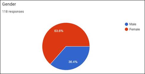
|
Figure 4 Gender of the Respondents |
From the Figure 4, it’s clear that, 63.6% of the respondents are Female and 36.4% of the respondents are Male. Hence it could be concluded that the majority of the respondents are Female respectively
4.1.3. Colour of Calming & Relaxing of the respondents
The data collected in Colour of Calming & Relaxing of the respondents for the response is presented in Figure 5
Figure 5
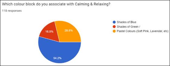
|
Figure 5 Colour of Calming & Relaxing of the Respondents |
From the Figure 5, it is clear that 54.2% of the respondents were chosen Shades of Blue, 28.8% were chosen Pastel colours (Soft pink, Lavender, etc) and 16.9% were chosen Shades of Green. Hence it could be concluded that majority of the respondents in the Colour of Calming & Relaxing were selected Pastel colours (Soft pink, Lavender, etc) respectively.
4.1.4. Colour of Energy & Vitality among the respondents
The data collected in Colour of Energy
& Vitality of the respondents for the response
is presented in Figure 6
Figure 6
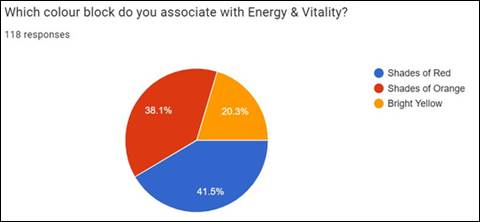
|
Figure 6 Colour of Energy & Vitality among the Respondents |
From the Figure 6, it is seen that 41.5% of the respondents were chosen Shades of Red, 38.1% were chosen Shades of Orange and 20.3% were chosen Shades of Yellow. Hence it could be concluded that majority of the respondents in the Colour of Energy & Vitality were selected Shades of Red respectively.
4.1.5. Colour of Happiness & Positivity among respondents
The data collected in Colour of Happiness & Positivity of the respondents for the response is presented in Figure 7
Figure 7
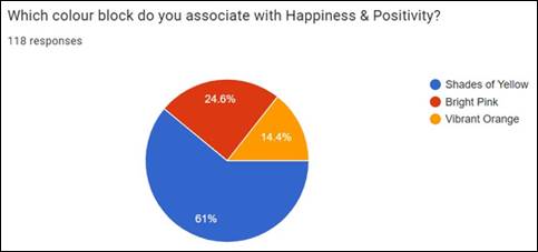
|
Figure 7 Colour of Happiness & Positivity Among Respondents |
From Figure 7, it is clear that 61% of the respondent’s where chosen Shades of Yellow, 24.6% of the respondents were chosen Shades of Pink and 14.4% of the respondents were chosen Shades of Orange. Hence it could be concluded that majority of the respondents in the Colour of Happiness & Positivity were selected Shades of Yellow respectively.
4.1.6. Colour of Balance & Harmony among the respondents
The data collected in Colour of Balance
& Harmony of the respondents for the response
is presented in Figure 8
Figure 8
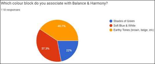
|
Figure 8 Colour of Balance & Harmony Among the Respondents |
From the Figure 8, it is seen that 40.7% of the respondents were chosen Shades of Earthy Tones (Brown, Beige, etc), 37.3% were chosen Shades of Blue & White and 22% were chosen Shades of Green. Hence it could be concluded that majority of the respondents in the Colour of Balance & Harmony were selected Shades of Earthy Tones (Brown, Beige, etc) respectively.
4.1.7. Colour of Creativity & Inspiration among the respondents
The data collected in Colour of
Creativity & Inspiration of the respondents for the response
is presented in Figure 9
Figure 9
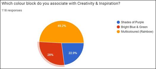
|
Figure 9 Colour of Creativity & Inspiration Among the Respondents |
From the Figure 9, it is seen that 49.2% of the respondents were chosen Multicoloured (Rainbow), 29% were chosen Bright Blue & Green and 22.9% were chosen Shades of Purple. Hence it could be concluded that majority of the respondents in the Colour of Creativity & Inspiration were selected Multicoloured (Rainbow) respectively.
4.1.8. Colour of Empowerment among the respondents
The data collected in Colour of
Empowerment of the respondents for the response
is presented in Figure 10
Figure 10
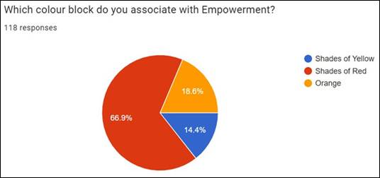
|
Figure 10 Colour of Empowerment Among the Respondents |
From the Figure 10, it is seen that 66.9% of the respondents were chosen Shades of Red, 18.6% were chosen Orange and 14.4% were chosen Shades of Yellow. Hence it could be concluded that majority of the respondents in the Colour of Empowerment were selected shades of Red respectively.
4.1.9. Colour of Strength & Resilience among the respondents
The data collected in Colour of
Strength & Resilience of the respondents for the response
is presented in Figure 11
Figure 11
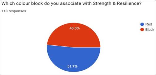
|
Figure 11 Colour of Strength & Resilience Among the Respondents |
From the Figure 11, it is seen that 51.7% of the respondents were chosen Red and 48.3% were chosen Shades of Black. Hence it could be concluded that majority of the respondents in the Colour of Strength & Resilience were selected Red respectively.
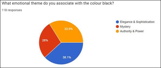
4.1.10. Emotional Theme of Black colour among the respondents
The data collected in Emotional Theme
of Black colour of the respondents for the response
is presented in Figure 12
Figure 12
|
Figure 12 Emotional Theme of Black colour Among the Respondents |
From the Figure 12, it is seen that 38.1% of the respondents were chosen Elegance & Sophistication, 33.9% were chosen Authority & Power and 28% were chosen Mystery. Hence it could be concluded that majority of the respondents in the Emotional Theme of Black colour were selected Elegance & Sophistication respectively.
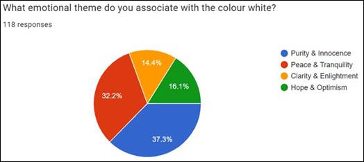
4.1.11. Emotional Theme of White colour among the respondents
The data collected in Emotional Theme
of White colour of the respondents for the response
is presented in Figure 13
Figure 13
|
Figure 13 Emotional Theme of White Colour Among the Respondents |
From the Figure 13, it is seen that 37.3% of the respondents were chosen Purity& Innocence, 32.2% were chosen Peace & Tranquility,16.1% were chosen Hope& Optimism and 14.4% were chosen Clarity & Enlightenment. Hence it could be concluded that majority of the respondents in the Emotional Theme of White colour were selected Purity& Innocence respectively.
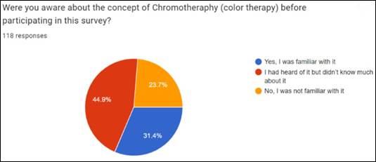
4.1.12. Awareness of Chromotherapy (Colour Therapy) among the respondents
The data collected in Awareness of Chromotherapy (Colour Therapy) of the respondents for the response is presented in Figure 14
Figure14
|
Figure 14 Awareness of Chromotherapy (Colour Therapy) Among the Respondents |
From the Figure 14, it is seen that 44.9% of the respondents were chosen I had heard of it but didn’t know much about it, 31.4% were chosen Yes, I was familiar with it and 23.7% were chosen I was not familiar with it. Hence it could be concluded that majority of the respondents in the Awareness of Chromotherapy (Colour Therapy) were selected I had heard of it but didn’t know much about it respectively.
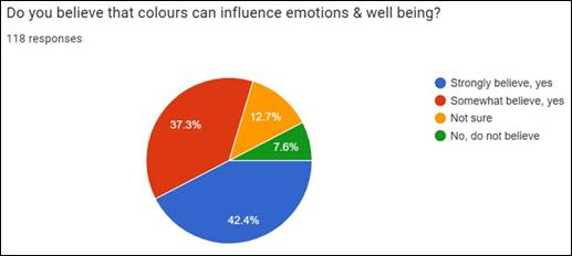
4.1.13. Colour Influence Emotions & Well-being among the respondents
The data collected in Colour Influence
Emotions & Well-being of the respondents for the response
is presented in Figure 15
Figure 15
|
Figure 15 Colour Influence Emotions & Well-Being Among the Respondents |
From the Figure 15, it is seen that 42.4% of the respondents were chosen Strongly believe, Yes, 37.3% were chosen Somewhat believe, Yes, 12.7% were chosen Not sure and 7.6% were chosen No, do not believe. Hence it could be concluded that majority of the respondents in the Colour Influence Emotions & Well-being were selected Strongly believe, Yes respectively.
4.1.14. Preferable clothing for Chromotherapy among the respondents
The data collected in Preferable
clothing for Chromotherapy of the respondents for the response
is presented in Figure 16
Figure 16
|
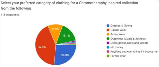
Figure 16 Preferable Clothing for Chromotherapy Among the Respondents |
From the Figure 16, it is seen that 42.4% of the respondents were chosen Casual wear, 26.3% were chosen Dresses and gowns, 16.1% were chosen Outer wear (coats & jackets) and 11.9% were chosen Active wear. Hence it could be concluded that majority of the respondents in the Preferable clothing for Chromotherapy were selected Casual wear respectively.
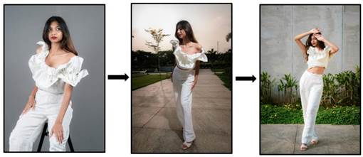
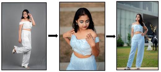
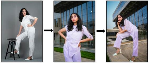
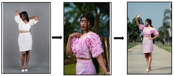
4.2. Phase 2: Design Development
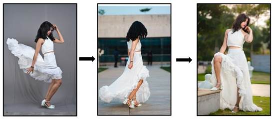
Based on the survey, photochromic dyes were applied to selected textile materials, which were then converted into garments, aligning with the preferences indicated by the respondents.
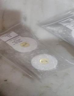
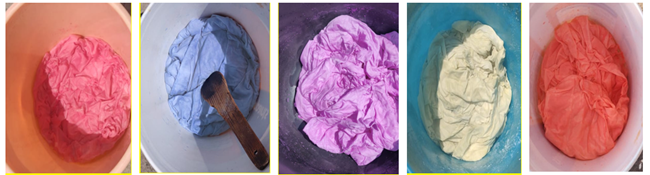
1) Selection and Collection of Fabric: For this study, chosen high-quality linen satin fabric suitable for garment construction. Consider factors such as weight, weave structure, and Colour compatibility with photochromic dye. Fabric was collected from “Suryansh Fab” in Hyderabad.
2) Preparation of Fabric: After purchasing the fabric, washed and pre - treated the fabric to remove any sizing or impurities. After that fabric was thoroughly dried and ironed to create a smooth surface for dye application.
Figure
17
|
Figure 17 Dye Source |
Figure
18
|
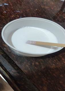
Figure 18 Dye
Preparation |
Figure
19
|
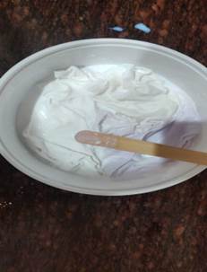
Figure 19 Dyeing
Process |
Figure
20
|
Figure 20
Application of the Photochromic Dye in to the Linen
satin (Under Sunlight) |
3)
Application
of Photochromic dye into the textile material: Chowdhury
et al. (2014) From the above table,
optimized the procedure for direct Colouration of textile using photochromic
Colourants. According to the procedure, amount of photochromic dye were taken on the basis of fabric weight and prepared the
dye solution. After that the fabric were treated into the dye solution (Hot
bath). Repeat the same process for the other colours. This
dyes are sourced from the local market named “UNIGLOW PRODUCTS LLC” in
Hyderabad.
4) Evaluation: Thorough visual analysis of dyed fabric samples under different lighting conditions, including natural sunlight (UV light) and Room temperature. Finally, Evaluated Colour-changing properties of the dyed fabric.
Figure 21
|
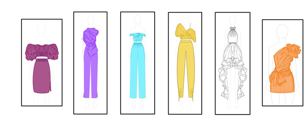
Figure 21 Design Development (CAD) |
Figure 22
|
Figure 22 Final Garment Design Rendering (CAD) |
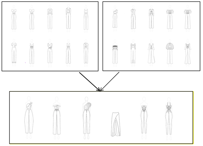
5) Pattern Development: Based on the primary
data, design
and pattern developed and finalized garment design with the help of CAD in Figure 21. From Figure 22, Considered garment
silhouettes, and design details that enhance the visual impact of the dyed
fabric. Selected Design pattern were created into
prototypes to test the compatibility of garment patterns with the properties of
the dyed fabric.
6) Final
Collection: The final garments were developed using the photochromic-dyed
in linen satin materials, following the preferences indicated by the survey
respondents.
Figure 23
|
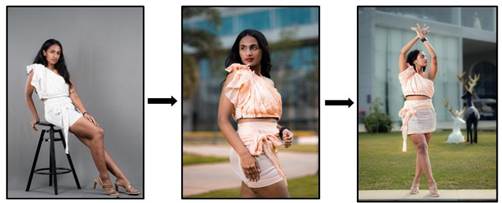
Figure 23 Photochromic Dyed Garment (Room to Sunlight) Orange Colour |
As shown in Figure 23, the garment appears white and undyed at room temperature, but changes Colour when exposed to UV light to orange.
Figure 24
|
Figure 24 Photochromic Dyed Garment (Room to Sunlight) Yellow Colour |
As shown in Figure 24, the garment appears white and undyed at room temperature, but changes Colour when exposed to UV light to Yellow.
Figure 25
|
Figure 25 Photochromic Dyed Garment (Room to Sunlight) Blue Colour |
As shown in Figure 25, the garment appears white and undyed at room temperature, but changes Colour when exposed to UV light to Blue.
Figure 26
|
Figure 26 Photochromic Dyed Garment (Room to Sunlight) Violet Colour |
As shown in Figure 26, the garment appears white and undyed at room temperature, but changes Colour when exposed to UV light to Violet.
Figure 27
|
Figure 27 Photochromic Dyed Garment (Room to Sunlight) Purple Colour |
As shown in Figure 27, the garment appears white and undyed at room temperature, but changes Colour when exposed to UV light to Purple.
Figure 28
|
Figure 28 Photochromic Dyed Garment (Room to Sunlight) White Colour |
As shown in Figure 28, the garment appears white and undyed at room temperature, but changes Colour when exposed to UV light to White.
5. LIMITATIONS OF THE STUDY
· The limitations of this current study include the small population sample from which data was collected and created the final garment.
· Limited colour range and intensity.
· While some photochromic dyes are quite durable, reduced stability and durability under prolonged exposure to light.
· Color identification through visual tests was conducted; however, color fastness testing and technical assessments were not employed.
1) Dynamic Therapeutic Clothing: In this study founds that fashion can treat mental sickness through chroma-therapy thereby making clothes having colour that have calming effect to stress, colour that reduces tension. Therapeutic clothing can be fashioned using photochromic dyes that respond to light exposure providing adaptive tones in functional apparel. For example, the colours of the garment change to the soothing tones at night that decrease stress and increase to the jolly tones in the next morning to increase the spirit.
2) Advanced Textiles and Materials: In the future, the creation of new fabrics that incorporate photochromic dyes, enhancing the practicality and appeal of chromotherapy in everyday wear and sustainable fashion, Integrating photochromic dyes with sustainable practices to create eco-friendly therapeutic clothing.
3) Future Technological Developments: Personalized Fashion: Apparel with flexible aesthetics may also be designed through AI in which the use of photochromic dyes can be made to support specific psychological needs. Simulating the apparels with photochromic dyes to help customers have a touch and feel of how the cloths will appear in varying light conditions through the virtual reality.
6. CONCLUSION
This study primarily examines the significance of chromotherapy in fashion and its profound effects on emotions and well-being. By exploring the principles of chromotherapy and their application in fashion design, this research reveals a fascinating intersection between color psychology and emotional harmony. To demonstrate this concept, photochromic dye was applied to linen satin fabric, showcasing dynamic color-changing effects that captivate the eye and engage the senses. This approach fosters a deeper connection between the wearer and the garment. Chromotherapy in fashion epitomizes a symbiotic relationship between artistry and science, aesthetics, and wellness. In the future, this type of chromotherapeutic dye can be applied for other functional purposes. Therapeutic clothing uses photochromic dyes for stress relief and sustainable fashion. AI designs personalized garments and virtual reality shows how they change under different light.
CONFLICT OF INTERESTS
None.
ACKNOWLEDGMENTS
None.
REFERENCES
Aldib,
M., & Christie, R. M. (2013a). Textile Applications of Photochromic
Dyes. Part 5: Application of Commercial Photochromic Dyes to Polyester Fabric
by a Solvent-Based Dyeing Method. Colouration Technology, 129(2), 131-143.
https://doi.org/10.1111/cote.12008
Awear. (2023, September 18). Revolutionizing
Fashion: The Rise of Smart Textiles. LinkedIn.
Brick, Y. (2023, December 21). The Impact of Colour in Fashion: Unleashing its Power. Yellowbrick.
Brognano, A. A. (2023, August 25). Colour Therapy: Types, Techniques, & Benefits. Choosing Therapy.
Chelsea, & Ricketson, C. (2023, October 18). Chromotherapy and Longevity - using Coloured Light Therapy. Spannr.
Chowdhury, M. A., Joshi, M., & Butola, B. S.
(2014). Photochromic and Thermochromic Colourants in Textile
Applications. Journal of Engineered Fibers and Fabrics, 9(1).
https://doi.org/10.1177/155892501400900113
Chromotherapy is the key to A better
mood: Beem® Light Sauna. beem® Light Sauna | Infrared
Sauna Studio. (2023, February 2).
Chwatt, N. (2023, October 20). NYFW Street Style Recap: The Fashion Crowd Goes Green. WWD.
Coronado, B. (2023, July 17). The Psychology Behind Colour
in Fashion and How to Use it to Your
Advantage. Purveyour.
Design, E. (2019, May 13). Erin Design.
Douglas, S. (2023, September 25). Wardrobe Guide: Dressing for Colour Therapy. Woman and Home Magazine.
Eggenberger, M.
(2024, January 27). These
9 Colours are the Centre of 2024's Biggest Fashion Trends. WhoWhatWear.
Gupta,
V. K. (2021). Photochromic Dyes for Smart Textiles. Dyes and Pigments -
Novel Applications and Waste Treatment.
https://doi.org/10.5772/intechopen.96055
How Colour can Affect Your Mood: All About Colours and Emotions - 2024. MasterClass. (2022b, September 10).
Jana, R. (2023, May 8). Fashion:
Why you Should
Wear Yellow This Summer: The Journal: Mr Porter. Fashion:
Why You Should Wear Yellow
This Summer | The Journal.
Klerk, A. D. (2022, January
10). Should we all be Dopamine Dressing?
Larkin, B. (2021, May 23). Blue Crystals: Healing Properties, Uses, & Benefits. Tiny
Larkin, B.
(2021b, June 19). Violet Crystals: Healing Properties, Uses, & Benefits.
Lorenmtaylor. (2023, June 7). Blue Crystals: Uses, Meaning & Healing Properties. Zen and Stone.
Maybray, B. (2023, July 11). Colour Psychology: How to use it in Marketing and Branding. The Hustle.
McDonald, S. (2023, December 13). Incorporating Colour Therapy in Design. Linearity Blog.
Morsümbül, S., & Akçakoca Kumbasar, E. P. (2018). (PDF) Photochromic Textile Materials. https://doi.org/10.1088/1757-899X/459/1/012053
Ohwovoriole, T. (2024, January 12). Colour Therapy: Definition, Types, Techniques, Efficacy. Verywell Mind.
PaulDart. (2023, August 21). Originales Online.
Radin, S. (2019, May 14). A Brief History of Colour, Fashion, and Political Solidarity. Teen Vogue.
Rolfe, I. (2023, May 25). Exploring the Profound Impact of Colour and Colour Therapy: Harness the Healing Power of Colour - House of Rolfe: Wearable Art, Silk, Fashion and Homewares Inspired by Nature. House of Rolfe | Wearable Art, Silk, Fashion and Homewares Inspired by Nature.
Stanton, K. (n.d.).
Colour and Emotions: How Colour Impacts Emotions and Behaviors.
Swartz , E. (2023). Healing Properties of Indigo. Healing Journeys Energy.
Topping, N. (2022, May
16). The 5 Yellow Dresses for Summer 2022. DivaCatwalk.
Tracy, J. (2021b, July 10). Orange Chakra: Sacral Chakra Colour Meaning. 7 Chakra Store.
Wilson, D. R. (2023, April 26). Want to Deepen Your Sensuality? Look to the Sacral Chakra. Healthline.
World, P. (2023, December
4). What is Chromotherapy?.
Psychologs Magazine | Mental Health
Magazine | Psychology Magazine | Self-Help Magazine.
Wylde, K. (2016, May 13).
How to Create a Chromotherapy-Inspired
Wardrobe. Nylon.
|
|
 This work is licensed under a: Creative Commons Attribution 4.0 International License
© ShodhKosh 2024. All Rights Reserved.